Simeon design research
Research on the marketing site of simeon.sh, "the revenue OS you can talk to". Simeon is a revenue dashboard for solo founders and creators who sell on several platforms (Stripe, PayPal, Polar, Gumroad, Lemon Squeezy, Shopify and more), with a Claude/ChatGPT connection over MCP. One person builds it: the footer says "Made entirely solo by Moshymercy. A French guy working from home, with no venture capital backing".
Captured on 2026-11-21 at 1440×900 (full page), plus 390 px and 768 px widths. Every value in these docs was read from the live DOM with getComputedStyle, document.fonts, document.getAnimations() or from screenshot pixels. Pixel estimates are marked ≈.
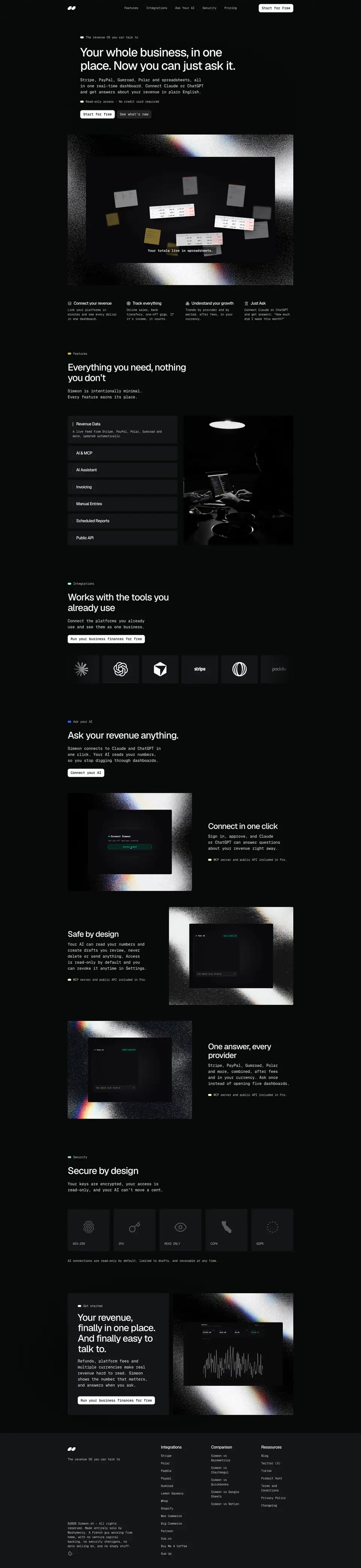
The site in one paragraph
A near-black page (#080A09) with one 900 px column, white Geist headings at weight 500 with tight −0.04em tracking, and every other word on the page set in Geist Mono. Colour lives only in 14×8 px pill dots in front of each section eyebrow (yellow, cyan, blue, green, pink) and in the hero's grainy white-and-prism "noise frame" that wraps the product video. Cards are flat #131517 blocks with a 4 px radius, no borders and no shadows. Motion is Framer's: a 1.5 s rise-and-fade per block, a word-by-word blur-in on the H1, a letter-by-letter blur-in on lead paragraphs, and a 50 px/s logo ticker.
Key numbers
| Token |
Value |
| Page background |
#080A09 |
| Card / footer surface |
#131517 |
| Secondary button |
#232326 |
| Heading colour |
#FFFFFF |
| Body colour |
rgba(255,255,255,.8) → #CECECE, 12.6:1 |
| Display font |
Geist 500, −0.04em, line-height 1.1 |
| Text font |
Geist Mono 400/500, −0.02em |
| Type scale (px) |
48 · 38 · 32 · 22 · 18 · 16 · 14 · 12 |
| Container |
900 px (270 px margins at 1440) |
| Section padding |
72 px top and bottom |
| Radius |
4 px (cards, images), 8 px (buttons), pill (dots, chips) |
| Reveal |
opacity + translateY 24 px, 1500 ms, cubic-bezier(.12,.23,.17,.99), 200 ms stagger |
Contents
Captured pages
/, /pricing, /blog, /blog/stripe-dashboard-net-revenue, /blog/polar-fee-increase-2026, /docs/changelog, /docs/privacy-policy, /integrations/stripe, /integrations/polar, /integrations/sumup, /vs/baremetrics, /vs/notion. Phone (390 px): home, pricing, nav closed and open. Tablet (768 px): home.
What is not measured
- Hover states. A real pointer hover on the white button changed no computed style; Framer hover variants either do not exist on these buttons or run outside the inspected element. The docs say "no hover found" instead of guessing.
- The hero product video's own animation (it is an 82 s MP4); it is documented with six frames.
- The site is built in Framer from a template (layer names such as
Image 7 [Change here], 1 [ Change content here] and a hidden CTA layer named "Move investing forward with intelligence" remain in the DOM). Some choices below are template defaults, not deliberate decisions, and the docs say which.
Public pages
Every public page on simeon.sh: 44 links. Source: /sitemap.xml (36 URLs, all return 200), plus the home-page anchors and off-site links in the header and footer. robots.txt allows all crawlers.
There is no /docs index, /about, /login or /changelog at the root; each returns 404. The changelog lives at /docs/changelog. The app sign-in is not linked from the marketing site; the primary CTA goes to a Polar checkout.
Marketing (2)
Integrations (14)
Comparisons (5)
Blog (10)
Changelog (1)
Legal (4)
Home anchors (4)
Off-site (4)
01 · Design principles
Simeon's site states its own principle in the second section: "Simeon is intentionally minimal. Every feature earns its place." The design follows the same rule. Six principles explain almost every choice on the site.
1. A terminal for money
All running text, nav links, buttons, footer links, prices and even blog-post bodies are set in Geist Mono. Only headings use proportional Geist. Monospace says "data", "ledger", "developer tool": the audience is technical solo founders who live in Stripe dashboards and code editors. It also makes numbers line up ($0, $23/month, -$312.00), which is the product's whole job.
Why: the product's promise is "the number that matters". A mono voice makes every line read like a figure from a statement, and signals "built by a developer, for developers" without saying so.
2. Dark, flat, almost no colour
Three neutrals carry the page: #080A09 page, #131517 cards, #232326 secondary buttons. No borders, no shadows, no gradients in CSS (backgroundImage is none on every element measured). Colour appears only as 14×8 px pill dots that code each section.
Why: finance dashboards are dark by convention (trading terminals, Stripe's dark mode), and a near-black page lets the one white button and the green "net revenue" figures in the video carry all the attention. Flat surfaces are also what a Framer template gives for free, and a solo builder gains nothing by fighting it.
3. One loud texture, used three times
The only decorative graphic is a grainy black-to-white noise field with a prism (red/green/blue) fringe, used as a frame around the hero video, the three "Ask your AI" visuals, and the final CTA image. It is a raster image, not CSS.
Why: it gives the site a single recognisable "look" that costs one asset. The grain reads as analogue and photographic, which softens an otherwise cold mono layout, and the prism fringe hints at "light through data".
4. Show the product, then say it once
The hero is an 82 s product film with captions ("Your totals live in spreadsheets." → "So we brought every provider into one place." → "Simeon. The financial OS for creators."). Each "Ask your AI" row pairs one screen with one sentence.
Why: a dashboard is easier to believe when you watch numbers aggregate. Captions inside the video mean the page copy can stay short.
5. Trust signals are structural, not decorative
"Read-only access · No credit card required" sits under the hero CTA. A whole section ("Secure by design") is five icon tiles: AES-256, 2FA, READ ONLY, CCPA, GDPR. Every "Ask your AI" row ends with a tag. The footer names the founder and says "no venture capital backing … no data selling".
Why: the product asks for API keys to payment accounts and lets an AI read revenue. The site answers the fear before the visitor raises it.
6. SEO pages do the selling
36 sitemap URLs, of which 19 are long-form integration and comparison pages ("Polar raised its fees 25% in 2026. Does your dashboard show the real impact?") and 9 are blog posts on fees and MRR. They share one plain template: H1, mono body, FAQ, CTA card.
Why: a solo founder without ad budget competes on search. Each page targets one "platform + net revenue" query, so the template is optimised for writing speed, not for art direction.
Where the principles break
- The sticky nav is transparent (
rgba(0,0,0,0), no backdrop blur), so page headings scroll under the nav text and collide with it (see the accordion screenshot).
- On a 390 px phone the hero paragraph breaks mid-word ("Polar and s / preadsheets"), because it is split into 160 single-letter spans for the blur animation and uses
word-break: break-word.
- Blog posts set 600-word articles in 12 px mono at 80 % white. That is legible (12.6:1) but small for long reading.
- Small inconsistencies: Pro is "$23/month" on /pricing but "$24/month" in the Baremetrics comparison table; footer heading "Ressources" is the French spelling.
02 · Color system
Simeon uses a dark neutral base and six small accent colours, one per section. All values below were read with getComputedStyle. Contrast ratios are WCAG 2.x, computed against the surface the text actually sits on (alpha text is blended first).
Neutrals
| Role |
Value |
Where |
Count on home |
| Page |
#080A09 (rgb 8,10,9) |
body background, every page |
— |
| Card / surface 1 |
#131517 (rgb 19,21,23) |
accordion rows, ticker tiles, security tiles, pricing cards, FAQ rows, CTA card, footer band |
63 elements |
| Surface 2 |
#232326 (rgb 35,35,38) |
secondary button "See what's new", pricing toggle track |
7 |
| Changelog card |
#121616 (rgb 18,22,22) |
release cover tile |
— |
| Cookie panel |
rgba(15,15,15,.9) |
cookie banner |
1 |
| Primary button |
#FFFFFF |
every primary CTA |
7 |
| Button text |
#08090A |
text on white buttons |
5 |
The page colour has a faint green cast (G channel 10 vs R 8, B 9). Cards move cooler (B 23 > R 19). The shift is tiny but it keeps the cards from looking like flat grey patches on a green-black page.
A faint dot grid sits behind the hero and the final CTA (Dots layer, a 2602×1566 PNG). Its dots are #060807–#070908 on #080A09, i.e. about 1–2 RGB steps darker than the page: visible only on a good screen. Brightened sample.
Text
| Role |
Value |
On |
Contrast |
| Headings |
#FFFFFF |
page |
19.85:1 |
| Body, nav, footer |
rgba(255,255,255,.8) ≈ #CECECE |
page |
12.62:1 |
| Body on card |
rgba(255,255,255,.8) ≈ #D0D0D1 |
#131517 |
11.88:1 |
| Tile labels (AES-256…) |
rgba(255,255,255,.7) ≈ #B5B6B5 |
#131517 |
9.76:1 |
| Button text |
#08090A |
#FFFFFF |
19.93:1 |
| Secondary button text |
rgba(255,255,255,.8) |
#232326 |
10.48:1 |
| Cookie text |
#B8B8B8 |
rgba(15,15,15,.9) |
9.66:1 |
Every text pair passes WCAG AAA (7:1). Hierarchy comes from two opacities of white (100 % for headings, 80 % for everything else), not from a grey ramp. That is why the page feels uniform: there is no third "muted" tier.
Section accents (eyebrow dots)
Each section eyebrow starts with a 14×8 px pill (border-radius: 9999px). The dot colour is the only colour in the section.
| Section |
Colour |
Contrast on page |
| Hero ("The revenue OS you can talk to") |
#FFFFFF |
19.85:1 |
| Features |
#D4B144 mustard |
9.62:1 |
| Integrations |
#9EFAFF ice cyan |
16.61:1 |
| Ask your AI |
#3064FF blue |
4.15:1 |
| Security |
#91CFB5 sage |
11.15:1 |
| Pricing |
#FE257F pink |
5.47:1 |
| Get started / blog dates |
#FFFFFF |
19.85:1 |
| Meta tags ("Read-only access…", "MCP server and public API included in Pro.") |
#F3FFC9 pale lime |
18.87:1 |

Why: a colour per section gives a long dark page a sense of chapters without adding any coloured surface. The dots are non-text graphics, so the 4.15:1 of the blue only needs 3:1 (WCAG 1.4.11), which it meets.
Status and brand accents
| Role |
Value |
Contrast |
Source |
| Discount chip text |
#4ADE80 |
8.09:1 on #043315 |
pricing "28% off" |
| Discount chip fill |
#043315 |
— |
pricing |
| Brand green |
#00FFA6 |
14.99:1 on page |
changelog v1.6.0: "the new brand colors (#00FFA6 and #FF004D)" |
| Brand red |
#FF004D |
5.07:1 on page |
same |
| Accordion active bar |
#D4B144 |
— |
features accordion (≈, read from screenshot) |
The changelog names #00FFA6 and #FF004D as brand colours, but on the marketing pages they appear only inside the product video (green for positive net revenue, red for refunds and fees). The marketing site itself stays neutral.
The noise frame
The prism noise visual (hero, Ask your AI, final CTA) is a raster image. Its palette goes from pure black through grain to near-white, with a thin red→green→blue fringe along the light edge (sampled ≈ #E0383F, #3BB36B, #4A6CF0). It is the only place where several hues meet. Crop.
Rules to copy
- One page colour, one card colour, one raised colour. No borders.
- Two text tiers only: 100 % and 80 % white.
- Colour only in tiny graphic marks (dots), one colour per section.
- Let product screenshots carry the saturated colour.
03 · Typography
Families
| Family |
Role |
Weights loaded and used |
Source |
Licence |
| Geist |
All headings H1–H6 |
500 (used); 400, 700, 500 italic declared but unloaded |
Google Fonts, fonts.gstatic.com/s/geist/v5/ |
SIL OFL 1.1, free. Designed by Vercel with Basement Studio (2023). |
| Geist Mono |
All body text, nav, buttons, prices, footer, blog bodies |
400, 500 (used); 700 for <strong>; 300 for the cookie banner |
Google Fonts, fonts.gstatic.com/s/geistmono/v6/ |
SIL OFL 1.1, free. Same designers. |
| Inter |
Not used on screen |
400, 700, 400 italic declared, never loaded |
Framer default |
OFL |
document.fonts shows only Geist 500 and Geist Mono 400/500 with status loaded on home; the rest are declared by Framer and never requested.
Get them: Geist on Google Fonts, Geist Mono, or npm i geist (the Vercel package, with next/font support). Free substitutes with the same feel, if you want to avoid looking identical: Inter Display or Manrope for headings; JetBrains Mono, IBM Plex Mono or Commit Mono for body.
Why this pair: Geist is the type of Vercel, Next.js and a whole generation of developer tools, so it reads "modern dev product" to the target audience at once. Pairing it with its own mono sibling means both faces share proportions and x-height, so a heading sits on mono body text without a clash. Using mono for paragraphs is the bold part: most sites use mono only for code.
Scale (desktop, 1440)
All headings use the same recipe: weight 500, line-height 1.1, letter-spacing −0.04em.
| Level |
Size / line-height |
Tracking |
Used for |
| H1 |
48 / 52.8 |
−1.92 px |
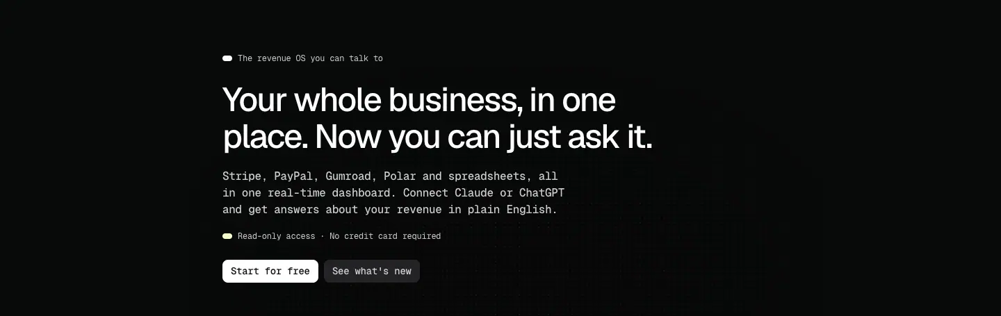
page titles ("Your whole business, in one place. Now you can just ask it.") |
| H2 |
38 / 41.8 |
−1.52 px |
section titles, blog post titles, final CTA |
| H3 |
32 / 35.2 |
−1.28 px |
"Ask your AI" row titles, blog index card titles |
| H3 (price) |
32 / 35.2, Geist Mono 400 |
−1.28 px |
$0, $23/month |
| H4 |
22 / 24.2 |
−0.88 px |
changelog versions, legal section titles |
| H5 |
18 / 19.8 |
−0.72 px |
pricing plan names |
| H6 |
16 / 17.6 |
−0.64 px |
action cards, accordion rows, FAQ questions, footer column heads |
Mono text styles:
| Style |
Spec |
Used for |
| Lead |
Geist Mono 500, 16 / 24, −0.32 px (−0.02em), 80 % white |
section descriptions, integration-page body |
| Small |
Geist Mono 400, 12 / 18, −0.24 px, 80 % white |
nav, eyebrows, card text, footer, blog-post body |
| Small strong |
Geist Mono 700, 12 / 18 |
blog sub-heads, changelog "New / Improved / Fixed", legal lead-ins |
| Button |
Geist Mono 500, 14 / 16.8, −0.28 px |
all buttons |
| Cookie |
Geist Mono 300, 11 / 15.4, #B8B8B8 |
cookie banner |
The ratio between steps is irregular (48 → 38 → 32 → 22 → 18 → 16), not a modular scale. It is a Framer template scale, tuned by eye.
Responsive
| Level |
1440 |
768 |
390 |
| H1 |
48 |
38 |
38 |
| H2 |
38 |
32 |
32 |
| Body |
unchanged |
unchanged |
unchanged |
Only display sizes step down; mono body stays 12/16 px at all widths.
Patterns
- Headings white, body 80 % white. Size and the face change (sans vs mono) do the hierarchy work; there is no grey ramp.
- Eyebrow: dot + 12 px mono label, 18 px line, sits 24 px above the H2.
- Two-sentence descriptions with manual line breaks. "Simeon is intentionally minimal. / Every feature earns its place." Breaks are set in Framer, so they hold on desktop.
- Inline code look in pricing. Some Pro features are
<code> elements in Geist Mono, same size as the rest; it is template markup, not a visual change.
Issues measured
- Blog index and blog posts have no H1: the title is an H2 (38 px). Changelog also starts at H2. Bad for SEO and screen readers.
- Long-form posts at 12 px mono, 18 px line-height, 600 px column ≈ 86 characters per line. That is long for mono at this size; 14–15 px would read better.
- Mid-word breaks on phones in letter-split paragraphs (see 11 · Motion).
04 · Layout, grid and spacing
Container
| Page type |
Content width |
Left edge at 1440 |
| Home, pricing, integrations, comparisons |
900 px |
270 px |
| Hero text block |
640 px (inset 50 px: x = 320) |
320 px |
| Section heading blocks |
480 px |
270 px |
| Blog index |
1080 px (two 528 px columns, 25 px gap) |
180 px |
| Blog post body, changelog body |
600 px (post) / 594 px (changelog) |
420 / 423 px |
A 900 px column on a 1440 screen leaves 270 px margins: a very narrow, centred page. It reads like a document or a terminal window, not a landing page. Why: with mono body text, a narrow column keeps lines short, and it matches the "intentionally minimal" claim.
Vertical rhythm (home)
Measured from Framer layer frames (data-framer-name).
| Gap |
Value |
| Nav height |
65 px (padding 16 px top/bottom) |
| Hero padding |
75 px top, 48 px bottom |
| Section padding |
72 px top and bottom (Features, Integrations, Ask AI, CTA) |
| Security padding |
72 px top, 48 px bottom |
| Heading block → content |
64 px (48 px in Integrations) |
| Eyebrow → H2 |
24 px |
| H2 → description |
20 px |
| Description → button |
20 px |
| Hero: heading block → video |
64 px |
| Hero video → action cards |
40 px gap between action cards |
| Alternating rows |
390 px tall, 64 px apart |
So two adjacent sections are 144 px apart (72 + 72). There are no divider lines; empty space and the eyebrow dot mark each new chapter.
Grids
| Block |
Grid |
| Action cards (under hero) |
4 columns across 900 px, 40 px gap |
| Features |
2 columns: accordion 438 px + 24 px gap + image 438 px; rows 10 px apart |
| Integrations ticker |
tiles 146 × 112 px, 12 px gap (158 px pitch), runs full bleed past the container |
| Ask your AI rows |
image 496 px + 64 px gap + text 340 px, alternating sides |
| Security tiles |
5 columns, 16 px gap, tiles ≈167 × 168 px |
| Final CTA |
text card 404 px + 16 px + image 480 px, both 485 px tall |
| Pricing |
2 cards ≈ 438 px each, 24 px gap (≈) |
| FAQ |
2 columns of question rows, 64 px row pitch |
| Footer |
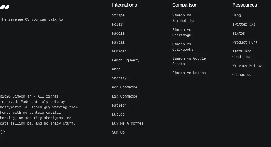
brand column left; 3 link columns on the right (Integrations, Comparison, Ressources), 72 px gap |
Card padding
| Card |
Padding |
| Accordion row (closed) |
20 32 20 20 (58 px tall) |
| Accordion row (open) |
24 32 20 20 (110 px tall) |
| CTA card |
40 px all round, 32 px internal gap |
| Footer band |
48 px top/bottom, full width |
Radius
Counted across all visible elements on home: 4 px × 103, 9999 px × 17 (dots, chips, toggle), 8 px × 6 (buttons), 6 px × 1, 2 px × 1. Images are clipped at 4 px.
Why so small: 4 px is "just not sharp". With no borders and no shadows, a bigger radius would make the dark blocks look like soft buttons; 4 px keeps them looking like panels in a terminal UI.
Responsive
- 390 px: one column, 16 px side gutters (≈, read from screenshot), nav becomes logo + hamburger; the menu opens full-screen with five links and a full-width white "Start for Free".
- Hero video frame keeps its aspect and scales to the column.
- Action cards stack in one column.
- 768 px: same one-column flow at a wider measure (home is 8976 px tall at 768 vs 6248 px at 1440).

05 · Heroes
Simeon has three hero types. All are left-aligned (the home hero is inset by 50 px), on the plain page colour, with no background image except the faint dot grid.
1. Home: statement + product film
| Part |
Spec |
| Eyebrow |
white dot + "The revenue OS you can talk to" (12 px mono) |
| H1 |
"Your whole business, in one place. Now you can just ask it." 48/52.8 Geist 500, two lines, 640 px block |
| Lead |
16/24 mono 500, three lines with manual breaks |
| Meta |
lime dot + "Read-only access · No credit card required" |
| CTAs |
"Start for free" (white) + "See what's new" (#232326), 33 px tall, 8 px gap (≈) |
| Visual |
900×600 frame: grainy prism noise image with an inset 754×423 autoplaying, muted, looping MP4 (82 s) |
| Under the visual |
four action cards: icon + H6 + 12 px mono sentence |
Why it works: the H1 does two jobs in two sentences: the old promise (all revenue in one place) and the new one (talk to it). The visual is not a static screenshot: the video tells a 4-beat story with its own captions (see 09 · Art direction). The four cards under it turn the story into a scannable list for visitors who do not watch.
Entrance: each word of the H1 blurs in (4 px → 0) with a 50 ms stagger; the lead paragraph blurs in letter by letter (10 px → 0); eyebrow, meta, buttons and video rise 24 px and fade in, 200 ms apart. See 11 · Motion.
2. Page hero (pricing, blog, changelog, legal)
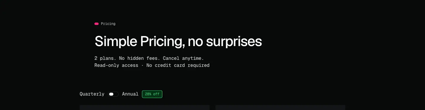
Eyebrow (coloured dot) + H1 or H2 + one or two mono lines. No visual. Pricing adds the Quarterly/Annual toggle with a "28% off" chip directly under the hero.
3. SEO hero (integration and comparison pages)
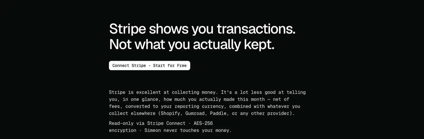
| Part |
Spec |
| H1 |
a full problem statement, 3–4 lines at 48 px in a 640 px column: "Stripe shows you transactions. Not what you actually kept." / "Polar raised its fees 25% in 2026. Does your dashboard show the real impact?" |
| CTA |
one small white button, labelled for the platform: "Connect Stripe · Start for free", "Connect Polar · Start for free" |
| Body |
starts right below, no visual |
Why: these pages target searchers with a specific pain ("Polar fee increase"). The H1 repeats their question back to them; the platform-named button promises the shortest route from that pain to the product.
06 · Section types
Every section on simeon.sh is built from the same header unit: eyebrow (dot + label) → H2 → one or two mono lines → optional button, left-aligned in a 480 px column, then content 64 px below. Twelve section types appear across the site.
| # |
Type |
Where |
Crop |
| 1 |
Statement hero + product film |
home |
hero |
| 2 |
Action-card row (4 × icon, title, line) |
home, under hero |
cards |
| 3 |
Accordion + swapping image |
home "Features" |
features |
| 4 |
Logo ticker |
home "Integrations" |
ticker |
| 5 |
Alternating image/text rows (zig-zag) |
home "Ask your AI" |
rows |
| 6 |
Icon tile row (5 badges) |
home "Secure by design" |
tiles |
| 7 |
Split CTA card (text card + visual) |
home end, every SEO page end |
CTA |
| 8 |
Pricing cards with toggle |
/pricing |
plans |
| 9 |
Two-column FAQ |
/pricing, SEO pages |
FAQ |
| 10 |
Comparison table (zebra rows) |
/vs/* |
table |
| 11 |
Long-form article (mono) |
blog, integrations, comparisons, legal |
article |
| 12 |
Release timeline (date left, entry right) |
/docs/changelog |
release |
There is no bento grid, no testimonial wall, no logo cloud of customers and no stats band. For a one-person product with no big-name customers, the site replaces social proof with security proof (type 6) and founder transparency (footer).
Details per type
3 · Accordion + image
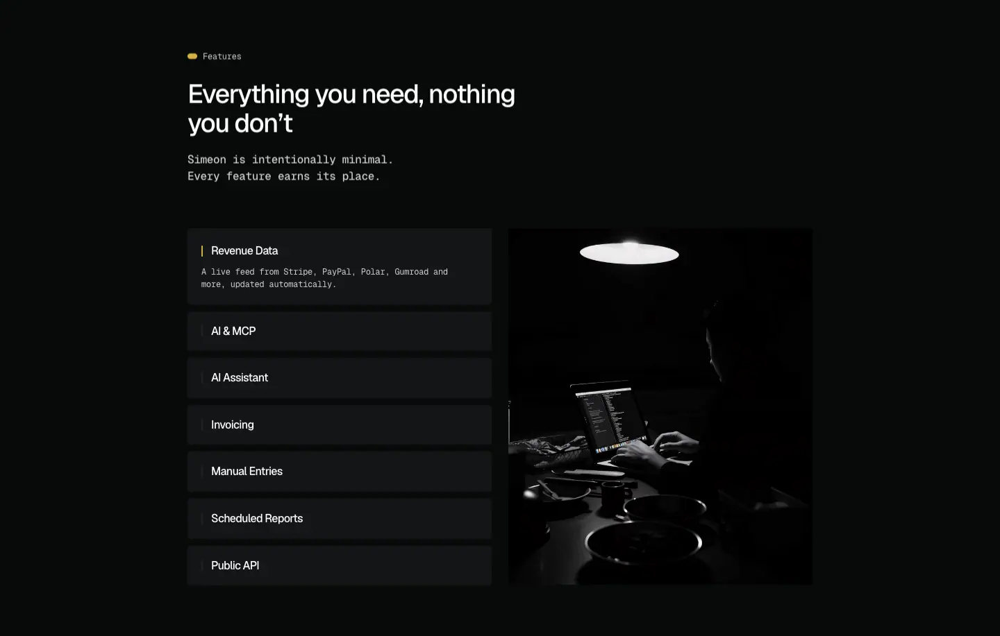
Seven rows (Revenue Data, AI & MCP, AI Assistant, Invoicing, Manual Entries, Scheduled Reports, Public API). One is open at a time: open row 110 px with a 12 px mono description and a mustard bar before the title; closed rows 58 px. Clicking a row swaps the right-hand image by cross-fade (≈150 ms) and grows the row (58 → 110 px in ≈150–200 ms). The images are dark, desaturated photos of people at screens. It does not auto-advance (sampled 8 s, no change).
Why: seven features would be a long list; the accordion shows one at a time and keeps the section at 515 px tall.
4 · Logo ticker
Tiles #131517, 146 × 112 px, 12 px gap, logos 57 px, white monochrome marks. Speed 50 px/s, linear, infinite (WAAPI: translateX(0 → −2528px) over 50 560 ms). The row extends past the 900 px container and fades at the edges.
5 · Zig-zag rows
Three rows, 390 px tall: 496 px noise-framed product screen + 340 px text (H3 32 px, 16 px lead, lime tag "MCP server and public API included in Pro."). Image left, right, left.
6 · Icon tile row
Five #131517 tiles, 4 px radius, ≈167 × 168 px, a 40 px grey line icon centred, label bottom-left in 12 px mono 70 % white: AES-256 (fingerprint), 2FA (key), READ ONLY (eye), CCPA (California outline), GDPR (EU star circle). A footnote line follows: "AI connections are read-only by default, limited to drafts, and revocable at any time."
7 · Split CTA
Left: #131517 card, 40 px padding, white dot "Get started", H2 four lines, mono paragraph, white button. Right: noise-framed dashboard image with an audio-wave style chart. Both 485 px tall. Dot grid behind. On SEO pages the CTA is a single centred card (no image) with a short H2 and "Start for free" / "Free trial".
10 · Comparison table
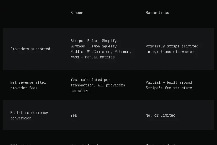
Header row with two column names (Simeon, competitor) in 12 px mono; rows alternate #131517 and page colour; 3 columns (label 1/3, Simeon, competitor). No check marks or icons: plain sentences ("Yes, calculated per transaction, all providers normalized").
Why: a sentence per cell reads as honest. The page also has a section "What Baremetrics does better (to be fair)", which carries the same tone.
12 · Changelog entry
Left rail: white dot + date ("Oct 13, 2026"); right: H4 version ("v.1.6.0"), a 594 × ≈395 px black cover tile with the logo, then bold-mono group labels (New / Pricing / Improved / Changed / Fixed) with bulleted 12 px mono lines.
07 · Copywriting and voice
Voice in one line
Plain, first-person-founder, slightly dry. Short declaratives, numbers instead of adjectives, and honesty used as a selling point.
Headline patterns
| Pattern |
Examples |
| Promise + twist (two sentences) |
"Your whole business, in one place. Now you can just ask it." · "Your revenue, finally in one place. And finally easy to talk to." |
| Anti-bloat |
"Everything you need, nothing you don't" · "Simple Pricing, no surprises" |
| Reassurance |
"Secure by design" · "Safe by design" |
| Plain verb phrase |
"Works with the tools you already use" · "Ask your revenue anything." · "Connect in one click" |
| Problem restated (SEO) |
"Stripe shows you transactions. Not what you actually kept." · "Notion is where builders track everything — including, often, revenue they have to update by hand." |
| Number in the H1 (SEO) |
"Polar raised its fees 25% in 2026…" · "Stripe's headline rate is 2.9% + $0.30. Your real rate depends on where your customers are…" |
Title case is mixed: section headings are sentence case, but "Simple Pricing, no surprises" capitalises Pricing.
Body patterns
- Concrete lists of platforms instead of "all your tools": "Stripe, PayPal, Gumroad, Polar and spreadsheets, all in one real-time dashboard."
- The customer's own question in quotes: "Connect Claude or ChatGPT and get answers: 'How much did I make this month?'"
- Negative capability as reassurance: "your AI can't move a cent", "never delete or send anything".
- Fairness: comparison pages include "What Baremetrics does better (to be fair)". Integration pages open by praising the competitor: "Stripe is excellent at collecting money."
- Worked examples with real arithmetic: "A $100 domestic sale: $2.90 + $0.30 = $3.20 in fees → you keep $96.80."
- Founder signature: "Made entirely solo by Moshymercy. A French guy working from home, with no venture capital backing, no security shenanigans, no data selling ba[ck], and no shady stuff."
Micro-copy
| Element |
Copy |
| Primary CTA (nav) |
Start for Free |
| Primary CTA (hero) |
Start for free |
| Secondary CTA |
See what's new (→ changelog) |
| Section CTAs |
Run your business finances for free · Connect your AI · See your net revenue for free · Connect Stripe · Start for free |
| Meta under CTA |
Read-only access · No credit card required |
| Pricing buttons |
Get Started |
| FAQ intro |
Can't find what you're looking for? Reach out at hello@simeon.sh |
| Blog title |
Some Thoughts |
| Changelog title |
Every update, fix, and new feature as they ship. |
Product film captions
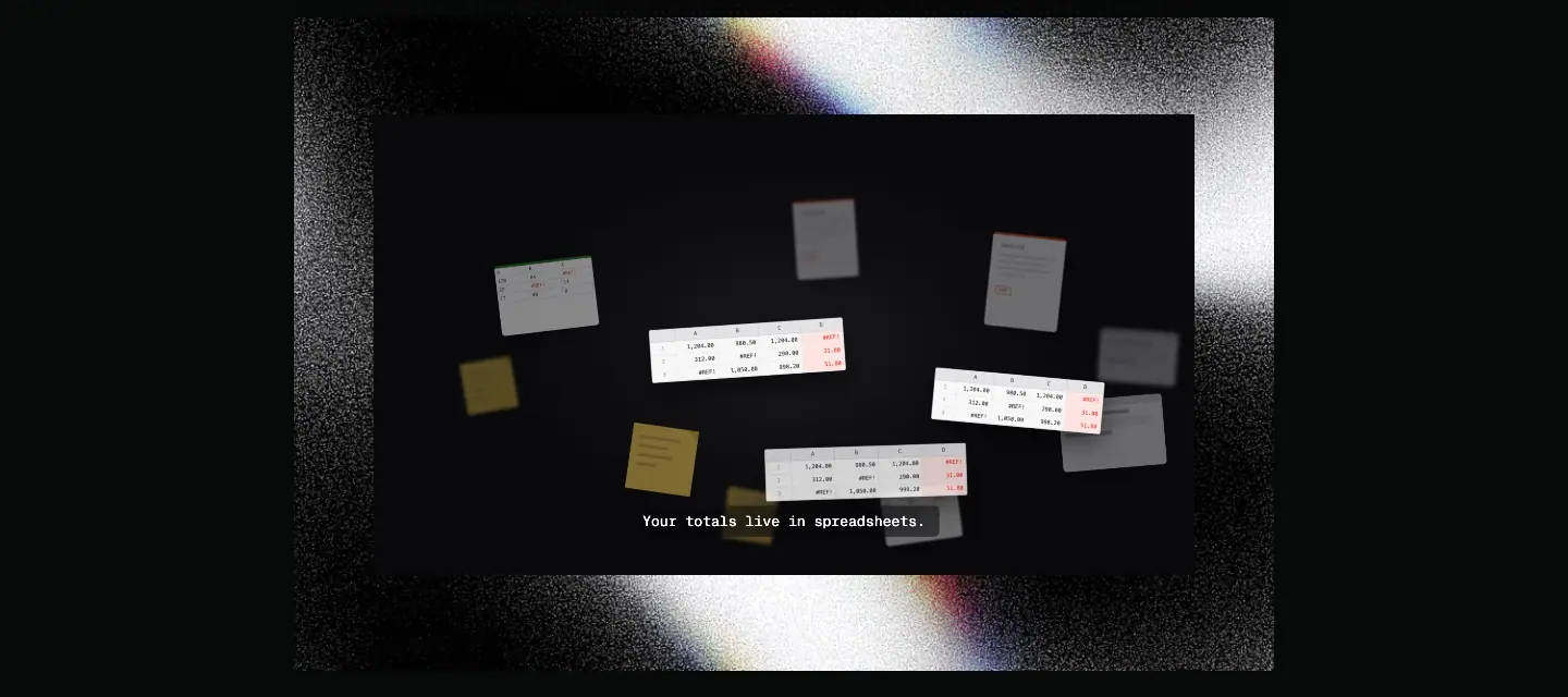
"Your totals live in spreadsheets." → "So we brought every provider into one place." → "Simeon. The financial OS for creators." → "Connect your providers. Everything aggregates."
Note the film says "financial OS for creators" while the page says "revenue OS you can talk to": the film predates the AI positioning.
Why this voice
The buyer is a solo founder handing over payment-provider keys to another solo founder. Plain sentences, real numbers, named competitors and a named person lower the trust gap more than polish would.
Inconsistencies found
- Pro price: "$23/month" (pricing) vs "$24/month" (Baremetrics table).
- "Unlimited accounts per providers" (grammar), "Ressources" (French spelling), "Paypal"/"Woo Commerce"/"Sum Up" vs "PayPal"/"WooCommerce"/"SumUp" elsewhere.
- Every
/vs/* page has the same <title>: "Stripe Net Revenue Dashboard • SIMEON SH"; /integrations/sumup uses the home title. These are SEO bugs on SEO pages.
08 · Components
Nav
| Property |
Value |
| Frame |
900 × 65 px, centred, padding 16 px 0, position: sticky, top: 0 |
| Background |
transparent (rgba(0,0,0,0)), no backdrop blur |
| Logo |
31 × 14 px white mark (two slanted parallelograms), left |
| Links |
Features · Integrations · Ask Your AI · Security · Pricing; 12 px Geist Mono 400, 80 % white, 32 px gap, centred group 448 px wide |
| CTA |
white "Start for Free", right |
The first four links are anchors on home (./#features …). Because the nav has no fill, page text scrolls underneath it and overlaps the link labels. This is the most visible flaw on the site.
Phone: logo + hamburger; open state is a full-screen black sheet with five 16 px links stacked and a full-width white button. closed · open
Buttons

| Variant |
Fill |
Text |
Size |
Radius |
| Primary |
#FFFFFF |
#08090A, Geist Mono 500 14 / 16.8, −0.28 px |
height 33 px, padding 8 × 12 |
8 px |
| Secondary |
#232326 |
80 % white |
same |
8 px |
| Pricing |
white, smaller ("Get Started", 12 px ≈) |
|
|
4 px ≈ |
No icon, no arrow, no shadow, no border. Hover: none measured (a real pointer hover left background, opacity and transform unchanged).
Eyebrow
14 × 8 px pill dot + 8 px gap + 12 px mono label. Colour coded per section (see 02 · Color). Also used for dates in blog and changelog (white dot).
Action card (no container)
16 px line icon (stroke) + H6 16 px Geist 500 + 12 px mono line. No background; four across. crop
Accordion row
#131517, 4 px radius, 438 px wide. Closed 58 px; open 110 px with description. Active row shows a 2 px ≈ mustard bar before the title; inactive rows show a dim grey bar. closed · open
Logo tile
146 × 112 px #131517, 4 px radius, 57 px monochrome logo centred. crop
Security tile
≈167 × 168 px #131517, line icon ≈40 px in mid-grey, label bottom-left 12 px mono 70 % white uppercase. crop
Pricing card
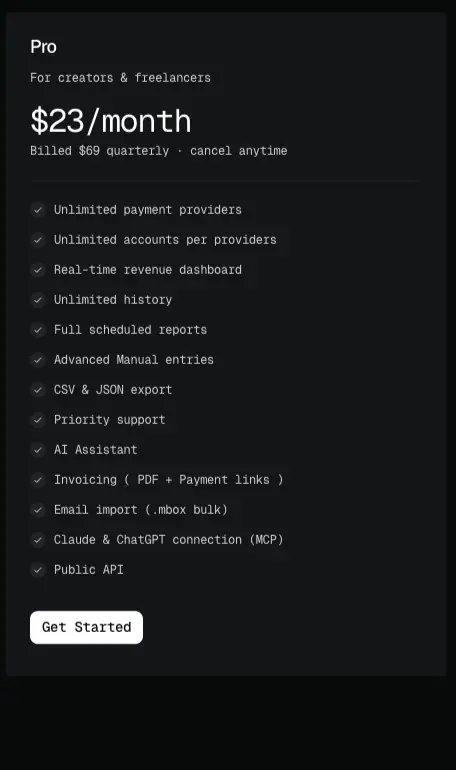
#131517, 4 px radius ≈. Plan name H5 18 px; audience line 12 px mono; price 32 px Geist Mono 400 ("$23/month"); billing line 12 px; 1 px divider ≈ #232326; feature list 12 px mono with a small grey circled check before each line, 30 px row pitch; button bottom-left.
Toggle: "Quarterly ⬤ Annual" with a 30 × 16 px ≈ pill switch on #232326 and a green "28% off" chip (#4ADE80 on #043315, 1 px green outline ≈). crop
FAQ row
#131517, 4 px radius, ≈ 48 px tall, question in H6 16 px Geist 500, a small chevron/plus right ≈. Two columns on /pricing, one column on SEO pages. crop
Comparison table
See 06 · Section types. crop
Blog card
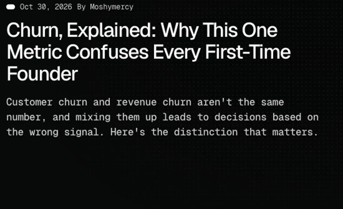
No container: white-dot date + "By Moshymercy" (12 px mono), H3 32 px title, 12 px mono excerpt; two columns. crop
Changelog cover tile
594 × ≈395 px black tile with the white logo mark centred: one generic image reused per release. crop
Cookie banner
Bottom-right card, rgba(15,15,15,.9), ≈360 × 160, "Cookie Settings" 12 px mono 300, text 11 px #B8B8B8, Reject (#131517) and Accept (black) buttons side by side. The choice persists across reloads.
Footer
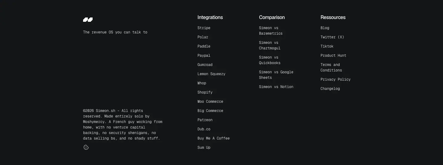
Full-width #131517 band, 48 px padding. Left: logo, tagline "The revenue OS you can talk to", copyright + founder line, a small circular icon. Right: three columns (Integrations ×14, Comparison ×5, Ressources ×7), H6 headings, 12 px mono links, 30 px pitch. crop
09 · Art direction
Overall look
Dark terminal + analogue grain. Everything structural is flat, black and monospaced. Three kinds of imagery break it up:
- a prism-noise frame (one graphic idea reused),
- moody photographs of people at screens,
- product UI in its own dark theme with green and red numbers.
1. Prism-noise frame
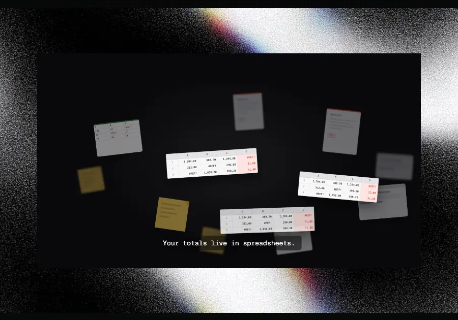
A raster image: black on one side, coarse film-grain noise building to near-white on the other, with a thin red/green/blue chromatic fringe where light meets dark, like light split through a prism or a CRT. A dark product screen (video or still) is inset with ≈40–70 px of frame visible around it, 4 px corners.
Used: hero (900 × 600), three "Ask your AI" rows (496 × 390), final CTA (480 × 485).
Why: one memorable texture gives the brand a signature for the cost of one asset. Grain reads as physical and photographic; the prism fringe adds the only multi-colour moment on the site, and points at "light" / "clarity" without an illustration. It also makes dark UI screenshots stand out from a dark page; without the bright frame, a dark screen on a dark page would disappear.
How to recreate: in Photoshop/Affinity, fill black, add a large soft white radial or diagonal gradient, add Noise (≈40–60 %, monochrome, Gaussian), then Threshold or Bitmap (diffusion dither) for hard grain. Duplicate the layer three times, colour each R, G and B with a Screen/Lighten blend and offset them 3–8 px along the gradient edge for the prism fringe. Export as PNG ≥ 2× size. In CSS you can approximate with an SVG feTurbulence noise layer masked by a gradient, but the site uses a bitmap.
2. Photography
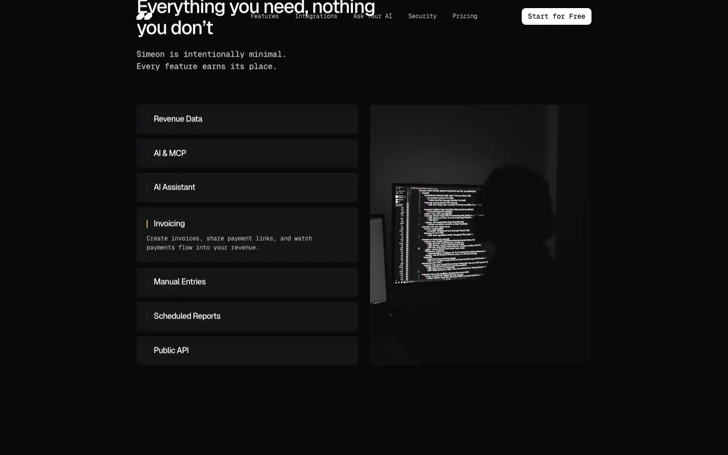
Seven photos swap in the Features accordion (438 × 515, portrait 3:4 crops). Style measured in the shots captured: very dark, low-key, mostly desaturated, a person seen from behind or in silhouette in front of a monitor full of code or numbers, a single practical light (desk lamp). Faces are never visible.
Why: the photos sell the solo founder at night ("so running your business finances takes minutes, not Sunday nights", from the meta description). Dark exposure keeps them inside the page palette, so they feel like part of the UI rather than stock inserts.
3. Product UI
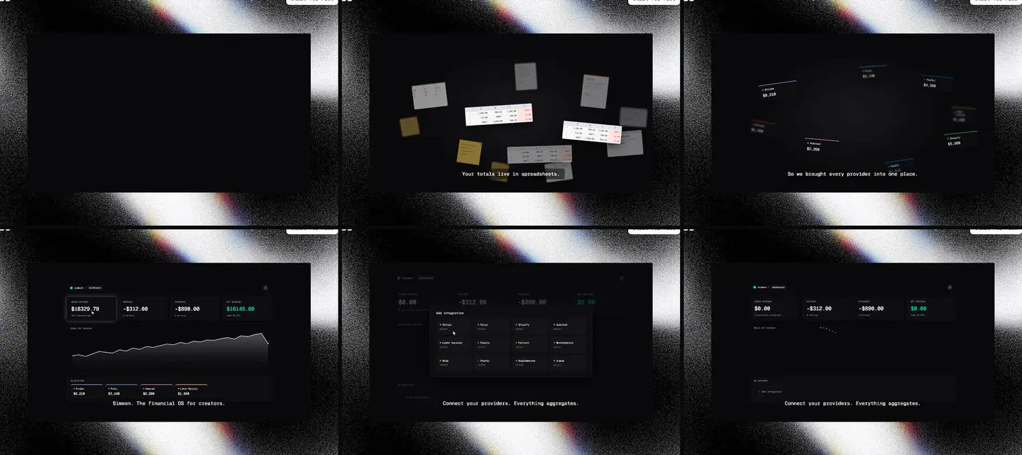
The hero film (MP4, 82 s, autoplay, muted, loop) shows the product in a dark UI: four KPI cards (gross, refunds, expenses, net revenue in green #00FFA6-like), a line chart of daily net revenue, provider chips with coloured top borders (Stripe purple, Polar white, Gumroad pink, Lemon Squeezy yellow), an "Add integration" grid. Beats: spreadsheets scattered → provider cards orbiting → dashboard → add-integration modal. Captions sit at the bottom in 12 px mono.
4. Icons
Line icons, ≈1 px stroke, rounded joins, 16 px in action cards and ≈40 px in security tiles, grey (#B8B8B8 measured on one 20 px icon) or white. Glyph subjects are literal: stack (connect), aperture (track), molecule/flower (growth), bank (ask), fingerprint, key, eye, state outline, EU stars.
5. Logo and wordmark
The mark is two white slanted parallelograms with a notch, like a pair of quote marks or "//" (31 × 14 px in the nav). Crop at 6×. No wordmark is used next to it in the nav. The <title> sets the name in capitals: "SIMEON SH". The mark is reused large on every changelog cover tile.
6. Third-party logos
Integration logos are white monochrome versions on #131517 tiles (Stripe wordmark, Polar circle, Paddle wordmark, OpenAI knot, Anthropic-like asterisk…), so the brand colours of other companies never enter the palette.
Rules to copy
- One signature texture, reused in 3–5 places, always framing product UI.
- Photos: dark, faceless, one light source, one subject at a screen.
- All third-party logos monochrome on the card colour.
- Saturated colour only inside product UI.
10 · Brand assets and graphics inventory
Every distinct graphic on simeon.sh, cropped from the 1440 px screenshots (PNG; small items enlarged). No SVGs were downloaded or generated.
| # |
Asset |
Crop |
What it is |
How it is made |
How to recreate |
| 1 |
Logo mark |
 |
two slanted white parallelograms with a notch, 31 × 14 px in nav |
PNG (igpmz99….png, 106 × 49 source) |
draw two parallelograms skewed ≈20°, cut a small step from each; one colour |
| 2 |
Prism-noise frame |
|
grain gradient with RGB fringe around product UI |
PNG (2400 × 1345 source), video inset |
see 09 · Art direction |
| 3 |
Ask-AI panel |
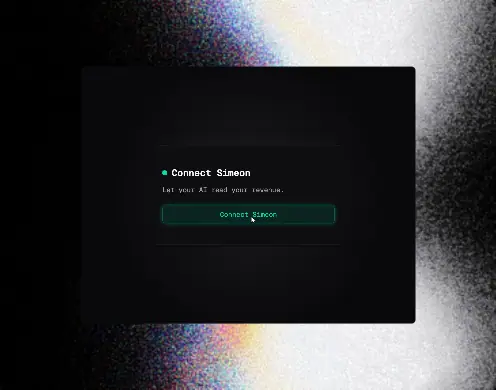 |
same frame, 496 × 390, UI still inside |
PNG |
same recipe, crop |
| 4 |
Final CTA visual |
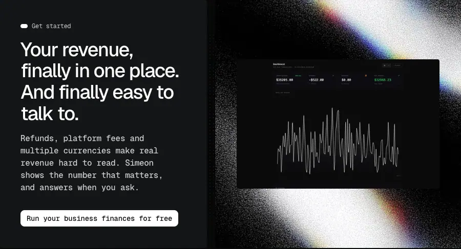 |
frame + dashboard with waveform chart |
PNG |
same recipe |
| 5 |
Dot grid |
 |
dots 1–2 RGB steps darker than the page (brightened 3× here) |
PNG layer Dots, 2602 × 1566 |
CSS radial-gradient(#060807 1px, transparent 1px) 0 0/8px 8px |
| 6 |
Eyebrow dots |
 |
14 × 8 pill, colour per section |
CSS div |
width:14px;height:8px;border-radius:9999px;background:<accent> |
| 7 |
Meta tag (lime) |
 |
lime dot + 12 px mono |
CSS |
as 6 with #F3FFC9 |
| 8 |
Action-card icons |
 |
16 px line icons |
inline SVG in Framer |
any 1 px-stroke icon set (Phosphor Thin/Light, Lucide at 1 px) |
| 9 |
Accordion row + bar |
 |
#131517 row, 2 px ≈ bar |
CSS |
flex row, ::before bar |
| 10 |
Feature photos ×7 |
|
dark faceless desk photos, 3:4 |
JPEG/PNG (1816 × 2400 / 908 × 1200 sources) |
low-key photo, desaturate 70 %, crush blacks to page colour |
| 11 |
Logo tiles |
 |
white logos on #131517 |
PNG/SVG images, 57 px |
monochrome logos, filter: brightness(0) invert(1) if needed |
| 12 |
Security tiles |
 |
5 line icons + labels |
inline SVG + CSS |
≈40 px line icon, grey, label 12 px mono |
| 13 |
Pricing toggle + chip |
 |
switch + "28% off" |
CSS |
pill switch, green chip #4ADE80 on #043315 |
| 14 |
Pricing card |
|
plan card with circled checks |
CSS + SVG checks |
see 08 · Components |
| 15 |
Comparison rows |
 |
zebra table |
CSS |
alternate #131517 / transparent rows |
| 16 |
Changelog cover |
 |
black tile + logo |
image |
one reusable 3:2 cover with the mark |
| 17 |
Date chip |
 |
white dot + date |
CSS |
as 6 |
| 18 |
Blog card |
 |
date + title + excerpt |
CSS |
no container |
| 19 |
FAQ row |
 |
question bar |
CSS |
#131517, 4 px |
| 20 |
Buttons |
 |
white / graphite |
CSS |
see 13 · Build recipe |
| 21 |
Footer |
 |
logo + 3 link columns |
CSS |
— |
| 22 |
Product film |
|
82 s MP4, 754 × 423 |
screen recording + motion edit |
record the app, add mono captions, export H.264 loop |
Brand kit availability
simeon.sh has no /brand, press kit or download page (404 on /about, /docs, /brand not in sitemap). The changelog v1.6.0 names two brand colours, #00FFA6 and #FF004D.
11 · Motion and interaction
All values come from document.getAnimations() (Framer Motion runs as Web Animations), sampled on page load and after scrolling. CSS transition is unset on every element (transitionDuration: 0s); there are no CSS @keyframes except Framer's editor spinner.
Measured animations
| Animation |
Targets |
Keyframes |
Duration |
Easing |
Delay / stagger |
| Block appear |
eyebrow, meta, buttons, video, action cards, section blocks (18 on load) |
opacity 0.001 → 1 and translateY(24px) → none |
1500 ms |
cubic-bezier(0.12, 0.23, 0.17, 0.99) |
0, 200, 400, 600 ms |
| H1 word blur-in |
12 word spans of the H1 |
opacity 0.001 → 1, filter blur(4px) → blur(0px) |
800 ms |
cubic-bezier(0.12, 0.23, 0.17, 0.98) |
50 ms per word (0 → 550 ms) |
| Lead letter blur-in |
136 letter spans of lead paragraphs |
opacity 0.001 → 1, blur(10px) → blur(0px) |
700 ms |
cubic-bezier(0.12, 0.23, 0.17, 0.98) |
starts at 200–300 ms |
| Logo ticker |
integrations row |
translateX(0) → translateX(−2528px) |
50 560 ms |
linear |
infinite → 50 px/s |
| Accordion open |
features rows |
height 58 → 110 px, image cross-fade |
≈150–200 ms (sampled at 70 ms steps) |
— |
on click |
Also measured on the inline styles: the H1 word spans start at translateY(12px) and settle to 0 over ≈680 ms with a strong ease-out (12 → 5.4 → 3.9 → 2.3 → 1.1 → 0.4 px in 60 ms samples).
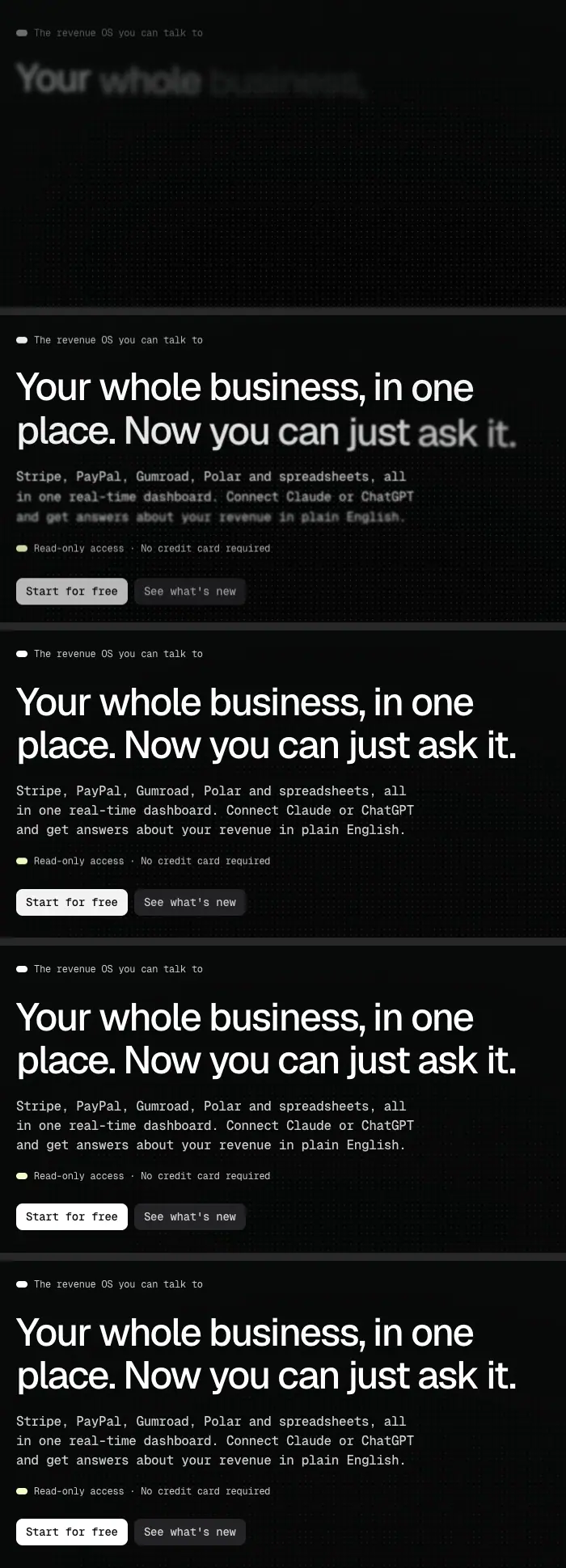
The curve cubic-bezier(.12,.23,.17,.99) is a very long ease-out: about 80 % of the movement happens in the first third, then the element drifts into place. Combined with 1.5 s, it feels calm and expensive, never snappy.
Scroll
- Below-the-fold blocks use the same 1500 ms appear when they enter the viewport (Framer "appear" with
data-framer-appear-id, 9 on home).
- Smooth scrolling is on (
SmoothScroll_Prod module loaded).
- No parallax, no pinned sections, no scroll-scrubbed animation found.
Hover and press
A real pointer hover on "Start for free" changed no computed value (background, opacity, transform, shadow) and started no animation. No hover state was found on buttons, cards or tiles. The accordion rows and FAQ rows have cursor: pointer.
Video
The hero MP4 is 82.0 s, autoplay, muted, loop, playback rate 1. Frames at 0 / 4 / 8 / 12 / 16 / 20 s: frames.
Why this motion
- Text that blurs into focus matches the product promise: messy numbers becoming clear.
- One long, soft curve for everything gives the page a single rhythm without tuning each element.
- Nothing moves on hover, so the page feels like a document; motion only happens on arrival.
Issues
- Letter splitting breaks words on phones. The hero lead is 160 spans with
word-break: break-word; at 390 px it wraps "s / preadsheets".
- Reduced motion: no
prefers-reduced-motion rule was found in the stylesheets; Framer may honour it in JS, not verified.
- 136 blur animations on load is heavy for low-end phones (
filter: blur is not cheap to composite).
Recipe
@keyframes rise { from { opacity: 0; transform: translateY(24px) } }
.appear { animation: rise 1.5s cubic-bezier(.12,.23,.17,.99) both }
.appear:nth-child(2) { animation-delay: .2s } /* +200 ms per item */

@keyframes focus { from { opacity: 0; filter: blur(4px); transform: translateY(12px) } }
.h1 .word { display: inline-block; animation: focus .8s cubic-bezier(.12,.23,.17,.98) both }
/* delay: calc(var(--i) * 50ms) */

@keyframes ticker { to { transform: translateX(-50%) } }
.ticker { animation: ticker 50.56s linear infinite } /* ≈50 px/s */

@media (prefers-reduced-motion: reduce) { .appear, .h1 .word, .ticker { animation: none } }
12 · Glossary
Terms you need to brief or build a page like simeon.sh.
| Term |
Meaning on this site |
| Eyebrow |
small label above a heading; here a coloured 14 × 8 px pill dot + 12 px mono text |
| Section colour coding |
one accent per section, used only in the eyebrow dot |
| Mono-forward typography |
setting body text, nav and buttons in a monospace face, headings in sans |
| Superfamily pairing |
sans + mono from one family (Geist / Geist Mono) so proportions match |
| Negative tracking |
letter-spacing below zero; −0.04em on all headings here |
| Two-tier text |
only two text colours: 100 % white headings, 80 % white body |
| Surface ramp |
page → card → raised: #080A09 → #131517 → #232326 |
| Flat UI |
no shadows, no borders, no gradients |
| Grain / film noise |
random pixel texture that imitates photographic grain |
| Chromatic aberration / prism fringe |
R, G, B channels offset along an edge |
| Noise frame |
the bright grainy border image that frames product UI |
| Dot grid |
faint repeating dot pattern behind a section |
| Product film |
autoplaying muted looping video of the product with captions |
| Action cards |
row of icon + title + line items with no container |
| Accordion with media |
expandable list whose active item swaps an image beside it |
| Logo ticker / marquee |
row of logos scrolling sideways in a loop |
| Zig-zag / alternating rows |
image-text rows that switch sides |
| Trust tiles |
icon tiles naming security or compliance facts |
| Split CTA |
closing call to action as a text card beside a visual |
| Programmatic SEO pages |
many pages from one template, one per keyword (integrations, "vs" pages) |
| Comparison table |
competitor vs product rows |
| Appear animation |
element fades and rises when it enters the viewport |
| Blur-in / focus-in |
text goes from blurred and transparent to sharp |
| Word / letter stagger |
each word or letter starts its animation a fixed time after the previous |
| Ease-out (long tail) |
curve that moves fast first, then slows for a long time |
| Sticky nav |
header that stays at the top while scrolling |
| Hamburger menu |
three-line icon that opens the phone menu |
| Framer |
no-code site builder used for simeon.sh |
Paste-ready brief
A dark, minimal SaaS landing page for a developer-minded audience. Page #080A09, cards #131517, no borders or shadows, 4 px radius. Headings in Geist 500 with −0.04em tracking (48/38/32 px, line-height 1.1); all other text in Geist Mono 12–16 px at 80 % white. One 900 px centred column. Each section opens with a coloured pill-dot eyebrow (one colour per section). One signature graphic: a grainy black-to-white noise frame with an RGB prism fringe around dark product screenshots. White 8 px-radius mono buttons. Motion: blocks rise 24 px and fade over 1.5 s with a long ease-out; the H1 blurs in word by word; integration logos scroll at 50 px/s.
13 · Build recipe
CSS tokens and component CSS that reproduce the simeon.sh system. Values are the measured ones.
@import url('https://fonts.googleapis.com/css2?family=Geist:wght@500&family=Geist+Mono:wght@400;500;700&display=swap');

:root {
  /* surfaces */
  --bg: #080A09;
  --surface-1: #131517;
  --surface-2: #232326;
  /* text */
  --text: #FFFFFF;
  --text-2: rgba(255,255,255,.8);
  --text-3: rgba(255,255,255,.7);
  --on-light: #08090A;
  /* section accents */
  --dot-features: #D4B144;
  --dot-integrations: #9EFAFF;
  --dot-ai: #3064FF;
  --dot-security: #91CFB5;
  --dot-pricing: #FE257F;
  --dot-meta: #F3FFC9;
  --brand-green: #00FFA6;
  --brand-red: #FF004D;
  --success: #4ADE80;
  --success-bg: #043315;

  /* type */
  --font-display: 'Geist', system-ui, sans-serif;
  --font-text: 'Geist Mono', ui-monospace, monospace;
  --h1: 48px; --h2: 38px; --h3: 32px; --h4: 22px; --h5: 18px; --h6: 16px;
  --lead: 16px; --small: 12px; --button: 14px;

  /* layout */
  --container: 900px;
  --section-y: 72px;
  --head-gap: 64px;
  --radius: 4px;
  --radius-button: 8px;

  /* motion */
  --ease-out-long: cubic-bezier(.12,.23,.17,.99);
  --dur-appear: 1500ms;
  --stagger: 200ms;
}

body { margin: 0; background: var(--bg); color: var(--text-2);
  font: 400 var(--small)/18px var(--font-text); letter-spacing: -.02em;
  -webkit-font-smoothing: antialiased; }

h1, h2, h3, h4, h5, h6 { font-family: var(--font-display); font-weight: 500;
  line-height: 1.1; letter-spacing: -.04em; color: var(--text); margin: 0; }
h1 { font-size: var(--h1); } h2 { font-size: var(--h2); } h3 { font-size: var(--h3); }
h4 { font-size: var(--h4); } h5 { font-size: var(--h5); } h6 { font-size: var(--h6); }
@media (max-width: 809px) { h1 { font-size: 38px; } h2 { font-size: 32px; } }

.container { width: min(var(--container), 100% - 32px); margin-inline: auto; }
.section { padding-block: var(--section-y); display: grid; gap: var(--head-gap); }
.section-head { max-width: 480px; display: grid; gap: 20px; }
.lead { font: 500 var(--lead)/24px var(--font-text); letter-spacing: -.02em; }

.eyebrow { display: inline-flex; align-items: center; gap: 8px; font-size: 12px; }
.eyebrow::before { content: ''; width: 14px; height: 8px; border-radius: 9999px; background: var(--dot, #fff); }

.btn { display: inline-flex; align-items: center; height: 33px; padding: 8px 12px;
  border-radius: var(--radius-button); font: 500 var(--button)/16.8px var(--font-text);
  letter-spacing: -.02em; text-decoration: none; }
.btn-primary { background: #fff; color: var(--on-light); }
.btn-secondary { background: var(--surface-2); color: var(--text-2); }

.card { background: var(--surface-1); border-radius: var(--radius); }
.accordion-row { background: var(--surface-1); border-radius: var(--radius); padding: 20px 32px 20px 20px; }
.accordion-row[open] { padding-top: 24px; }

.tiles { display: grid; grid-template-columns: repeat(5, 1fr); gap: 16px; }
.tile { aspect-ratio: 1; background: var(--surface-1); border-radius: var(--radius);
  display: grid; place-items: center; position: relative; }
.tile span { position: absolute; left: 12px; bottom: 12px; color: var(--text-3); text-transform: uppercase; }

.zigzag { display: grid; grid-template-columns: 496px 340px; gap: 64px; align-items: center; }
.zigzag:nth-child(even) { grid-template-columns: 340px 496px; }

.nav { position: sticky; top: 0; height: 65px; display: flex; align-items: center;
  justify-content: space-between; background: rgba(8,10,9,.8); backdrop-filter: blur(12px); }
/* the live site leaves the nav transparent; the fill above fixes the text overlap */

.footer { background: var(--surface-1); padding-block: 48px; }

/* motion: see 11-motion-interaction.md */
Build checklist
- Load Geist 500 and Geist Mono 400/500/700 only.
- Build the 900 px column and the eyebrow → H2 → lead header unit first; every section reuses it.
- Make one noise-frame image (see 09) and reuse it 3–5 times around dark product screens.
- Pick one accent per section; use it only in the eyebrow dot.
- Add the 1.5 s appear on blocks and the word blur-in on the H1. Skip letter splitting on phones.
- Fix what simeon.sh misses: nav fill, an H1 on every page, unique
<title> per SEO page, 14 px body for long articles, a hover state on buttons.
Home · /
https://simeon.sh/ · 6248 px tall at 1440 · 8366 px at 390 · <title> "SIMEON SH • The revenue OS you can talk to"
Eleven sections, all inside a 900 px column except the footer band and the logo ticker.
1. Nav (0–65)
 Logo left, five 12 px mono links centred (32 px gap), white "Start for Free" right. Sticky and transparent. Why: mono links echo the body face; anchors on home make the nav a table of contents. Issue: no fill, so content scrolls under the links.
2. Hero copy (65–520)
- Eyebrow white dot "The revenue OS you can talk to" at y 140.
- H1 48/52.8 Geist 500, −1.92 px, 640 px wide, two lines.
- Lead 16/24 mono 500 at 80 %, three lines.
- Lime-dot meta "Read-only access · No credit card required".
- Buttons 33 px tall: white "Start for free", graphite "See what's new".
- Hero frame padding 75 px top; heading block inset to x 320 (50 px inside the column).
Why: the H1 shifts the category from "dashboard" to "you can ask it"; the meta line removes the two biggest objections (security, payment) before the click.
3. Hero visual (520–1160)
900 × 600 noise frame, 4 px radius, with a 754 × 423 MP4 (82 s loop) inset. Story frames: video frames. Why: shows aggregation happening instead of describing it.
4. Action cards (1160–1328)
 Four columns, 40 px gap: icon + H6 16 px + 12 px mono line. "Connect your revenue / Track everything / Understand your growth / Just Ask". Why: a 4-step summary of the film for skimmers.
5. Features (1328–2245)
Padding 72 px; heading block 480 px (mustard dot "Features", H2 38 px "Everything you need, nothing you don't", lead "Simeon is intentionally minimal. / Every feature earns its place."). 64 px below: accordion (438 px) + photo (438 × 515). Seven rows, first open by default, no auto-advance. Why: seven features without a seven-card grid; photos add warmth.
6. Integrations (2245–2795)
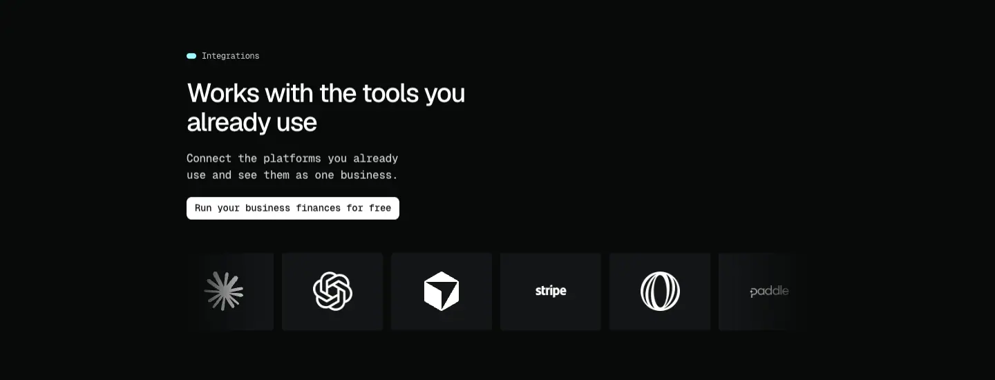 Cyan dot; H2 "Works with the tools you already use"; lead; white button "Run your business finances for free"; 48 px below, the logo ticker: 146 × 112 tiles, 12 px gap, 50 px/s, full bleed with edge fade. Why: motion signals "and more" without listing all 14 platforms.
7–8. Ask your AI (2795–4530)

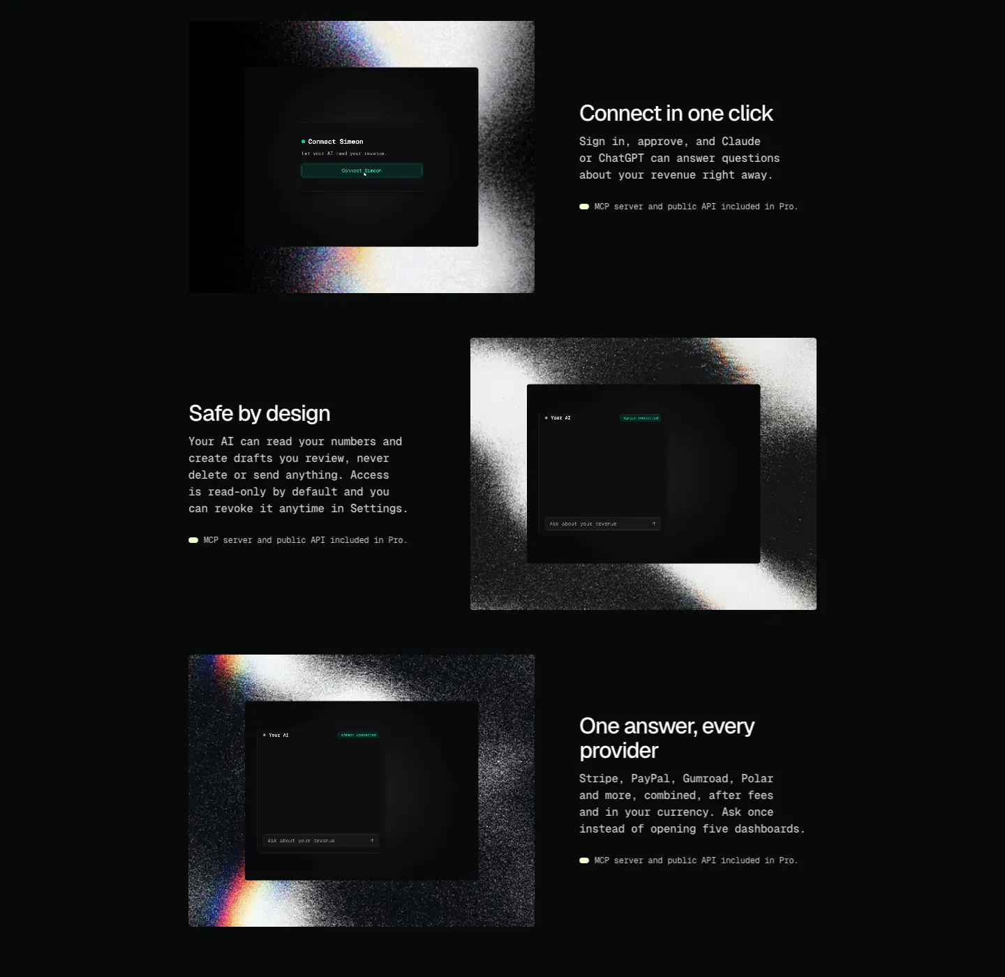 Blue dot; H2 "Ask your revenue anything."; lead; button "Connect your AI". Then three zig-zag rows (496 px framed screen + 340 px text, 64 px gaps, 390 px tall): "Connect in one click", "Safe by design", "One answer, every provider", each ending with the lime tag "MCP server and public API included in Pro." Why: the AI feature is the newest and the scariest; each row answers one question (how, is it safe, what for).
9. Security (4530–5081)
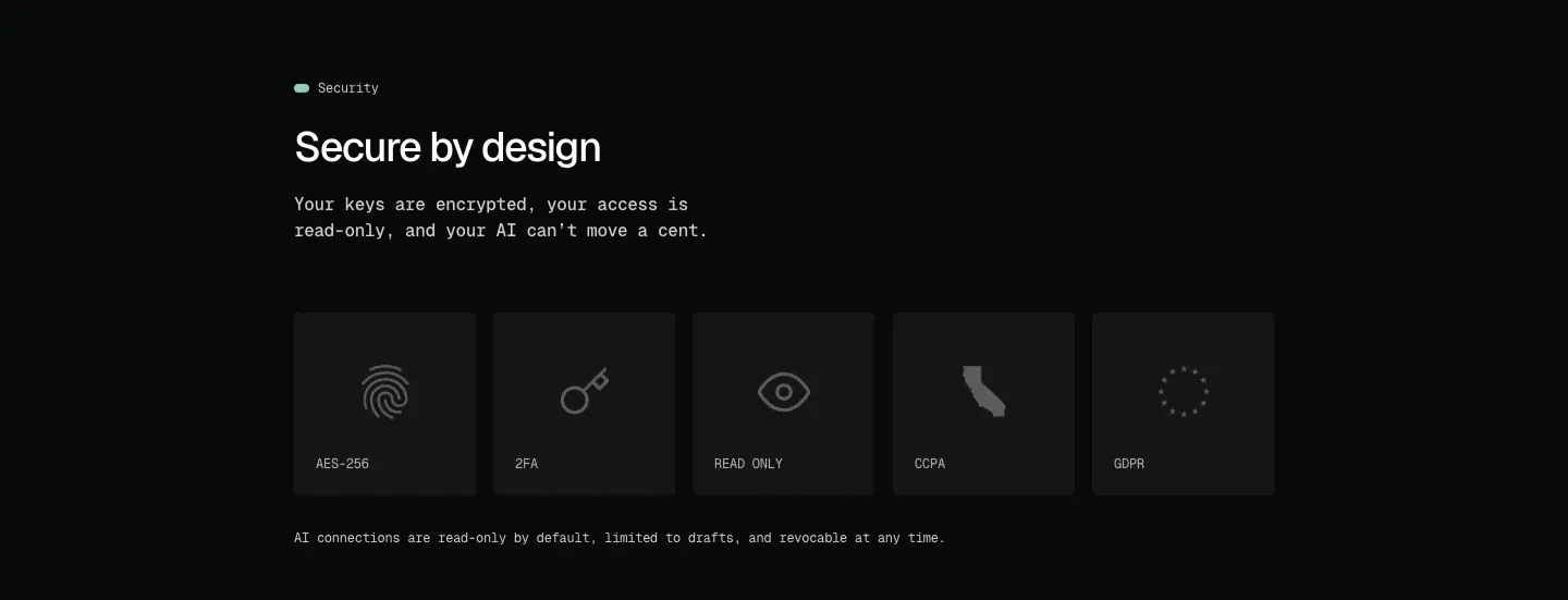 Sage dot; H2 "Secure by design"; lead "Your keys are encrypted, your access is read-only, and your AI can't move a cent."; five tiles (AES-256, 2FA, READ ONLY, CCPA, GDPR), 16 px gap; footnote line. Why: replaces customer logos with compliance facts, which a solo product can actually claim.
10. Final CTA (5081–5712)
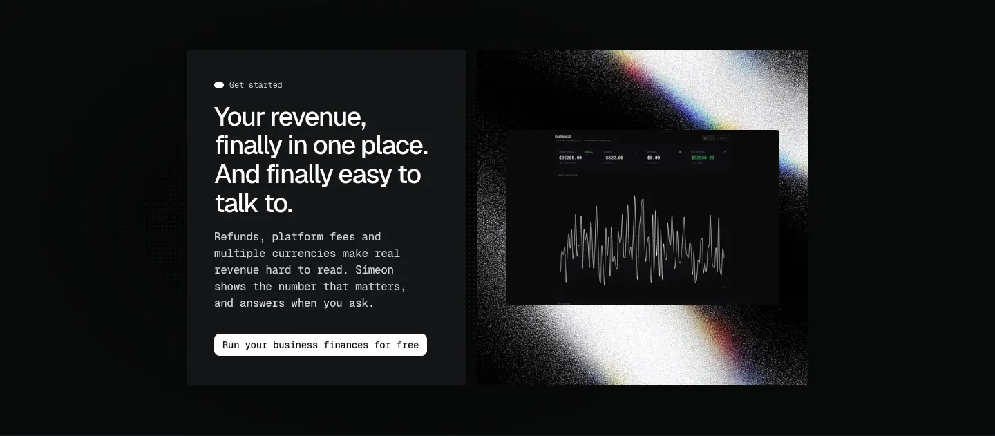 Dot grid behind. Card 404 × 485 (
#131517, 40 px padding): white dot "Get started", H2 four lines "Your revenue, finally in one place. And finally easy to talk to.", lead, white button. Visual 480 × 485 noise frame with dashboard. Why: repeats the H1 promise in a softer voice, and ends on the product.
11. Footer (5712–6248)
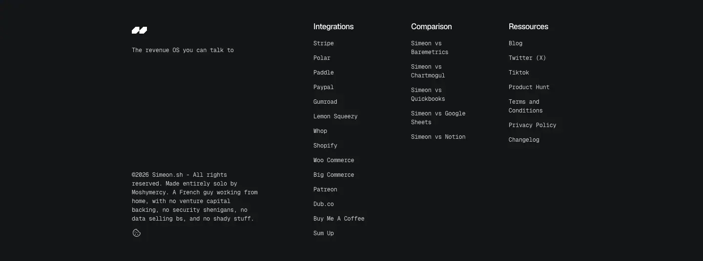 See shared header and footer.
Phone (390)
Single column; H1 38 px, H2 32 px; hero lead breaks mid-word because of the letter-split animation.
Pricing · /pricing
https://simeon.sh/pricing · 2762 px tall · <title> "SIMEON SH • The revenue OS you can talk to" (the home title)
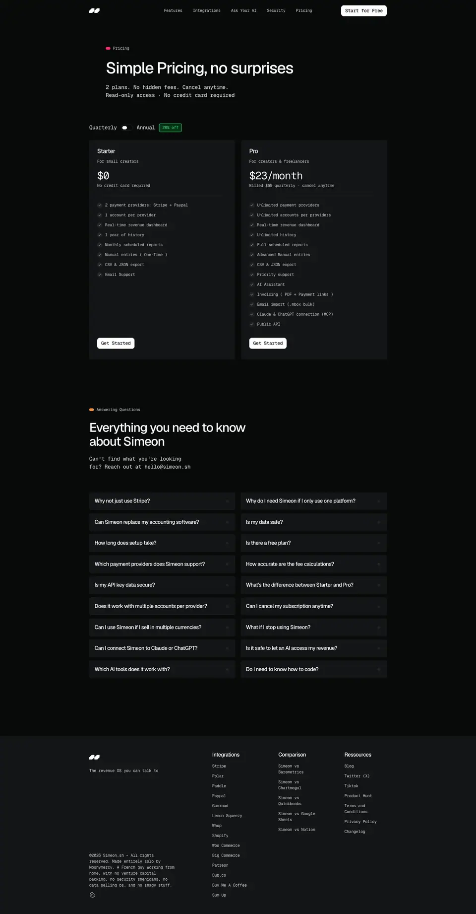
1. Hero (65–440)
Pink dot "Pricing"; H1 48 px "Simple Pricing, no surprises"; two mono lines "2 plans. No hidden fees. Cancel anytime. / Read-only access · No credit card required"; toggle "Quarterly ⬤ Annual" + green "28% off" chip at y 374.
2. Plans (440–1220)
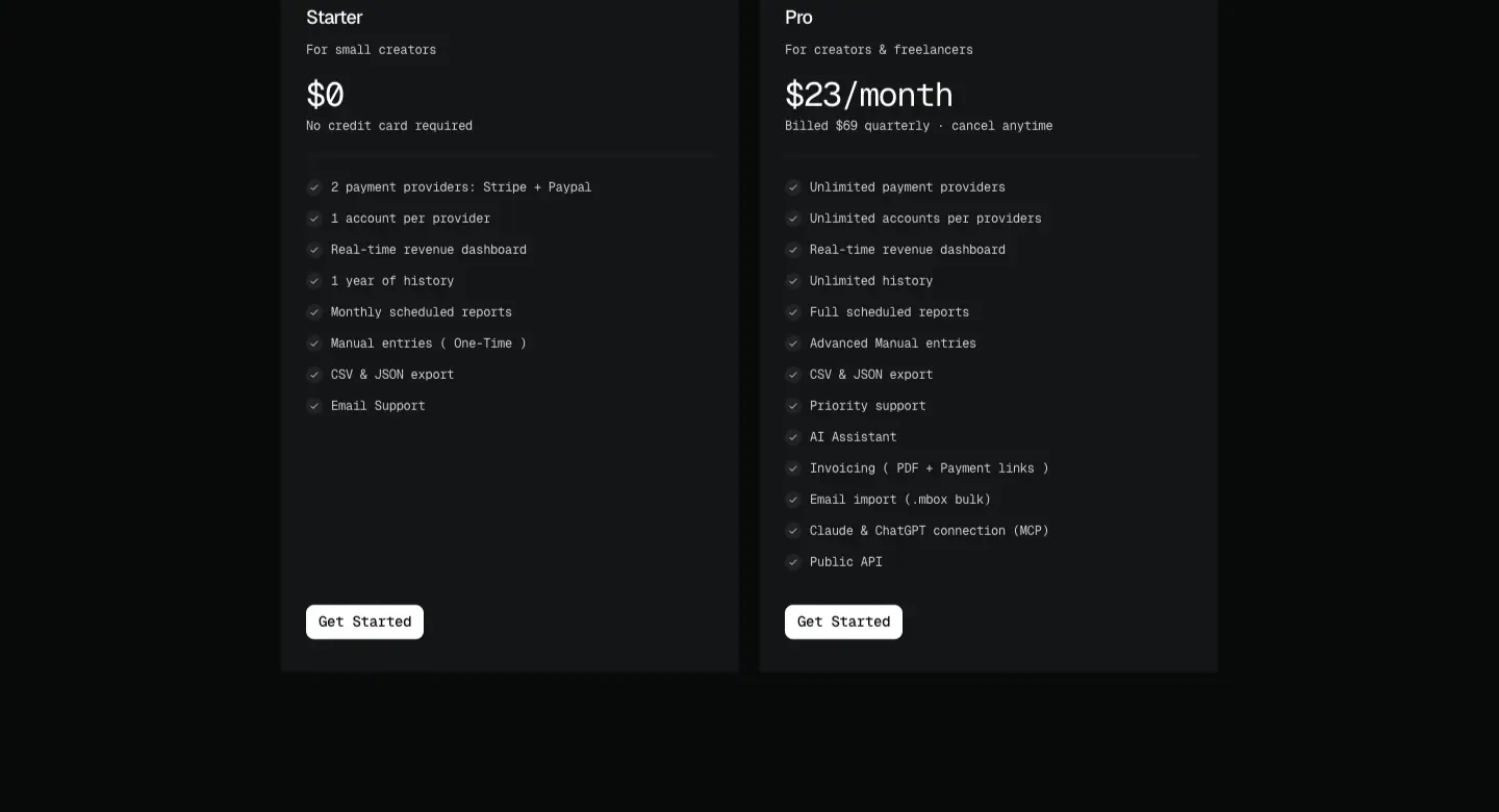 Two
#131517 cards side by side.
|
Starter |
Pro |
| Audience |
For small creators |
For creators & freelancers |
| Price |
$0 (32 px Geist Mono 400) |
$23/month, "Billed $69 quarterly · cancel anytime" |
| Features |
8 lines |
14 lines |
| CTA |
Get Started |
Get Started |
Feature rows 12 px mono, 30 px pitch, grey circled check. Both buttons are white; Pro is not highlighted by colour, border or badge. Why: with two plans and a free tier, the site does not push; the longer list does the upsell. Consequence: the eye has no default choice; a "recommended" marker would be a cheap win.
3. FAQ (1220–2224)
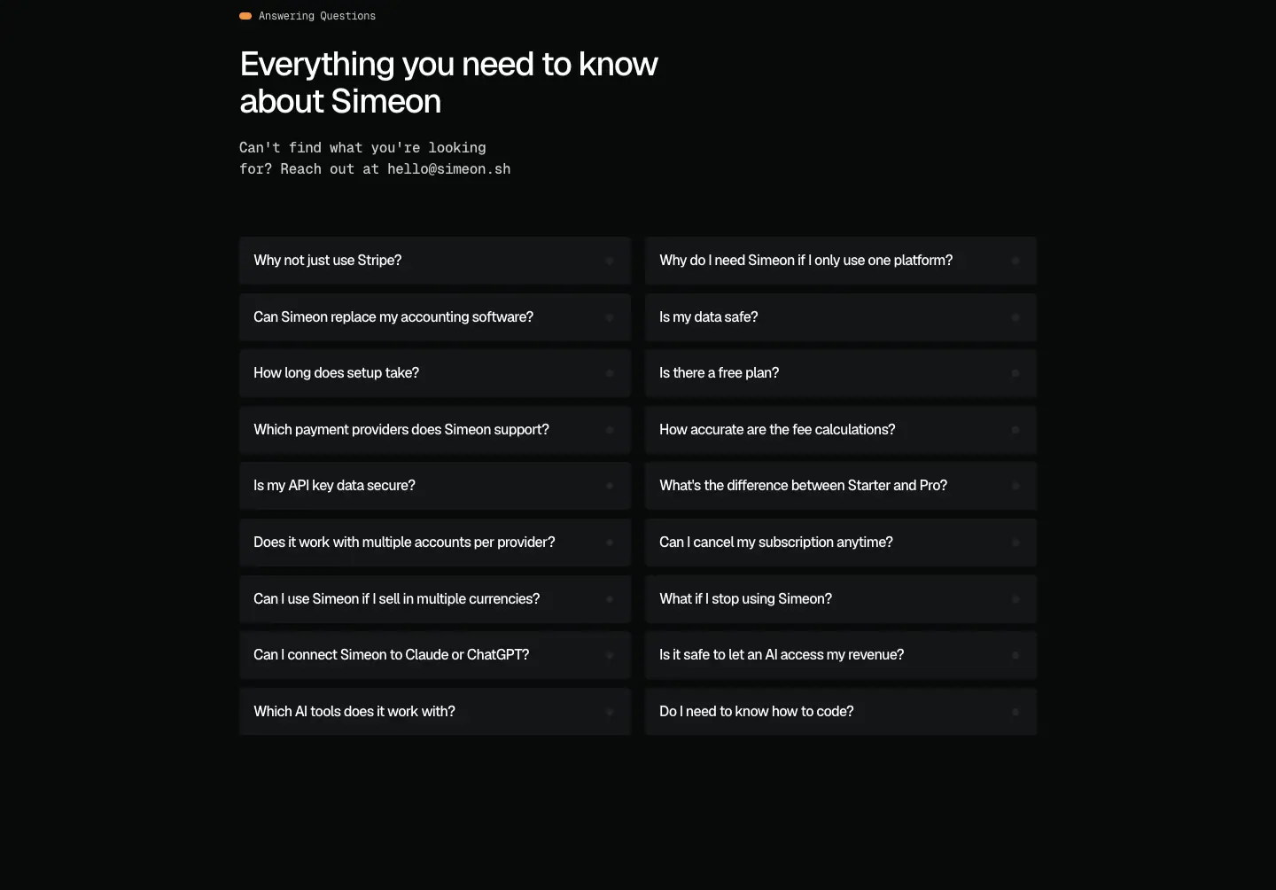 Eyebrow "Answering Questions"; H2 "Everything you need to know about Simeon"; line "Can't find what you're looking for? Reach out at hello@simeon.sh"; 18 questions in two columns,
#131517 rows. Topics: Stripe alone, safety, setup time, accuracy, cancellation, currencies, AI access, coding.
4. Footer
Phone
 Cards stack; toggle stays on one line.
Integration page template · /integrations/*
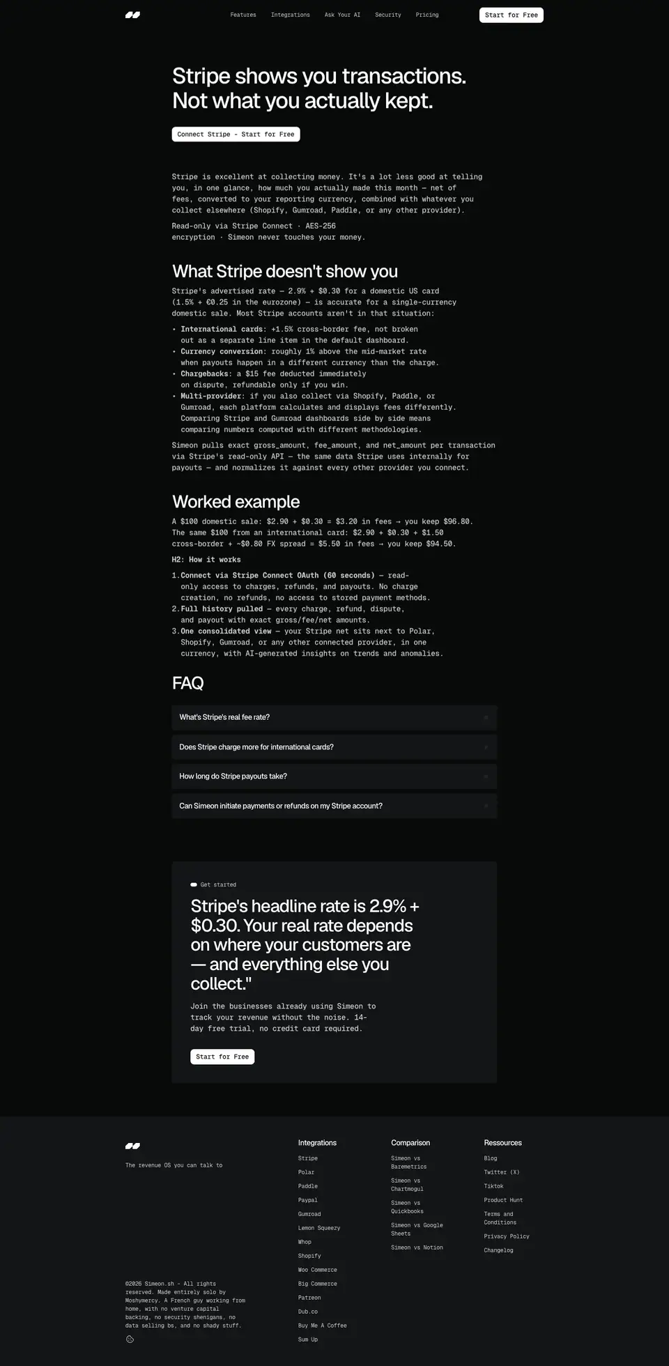
14 pages (Stripe, Gumroad, Lemon Squeezy, Whop, Shopify, WooCommerce, BigCommerce, Patreon, Dub.co, Buy Me a Coffee, PayPal, Polar, Paddle, SumUp). Captured: Stripe (2940 px), Polar (2658 px), SumUp (2964 px).
Structure
| Block |
Stripe page |
Spec |
| H1 |
"Stripe shows you transactions. Not what you actually kept." |
48/52.8, 640 px column at x 400 ≈ |
| CTA |
"Connect Stripe · Start for free" |
one white button |
| Intro |
"Stripe is excellent at collecting money. It's a lot less good at telling you…" |
16/24 mono 500 |
| H2 + list |
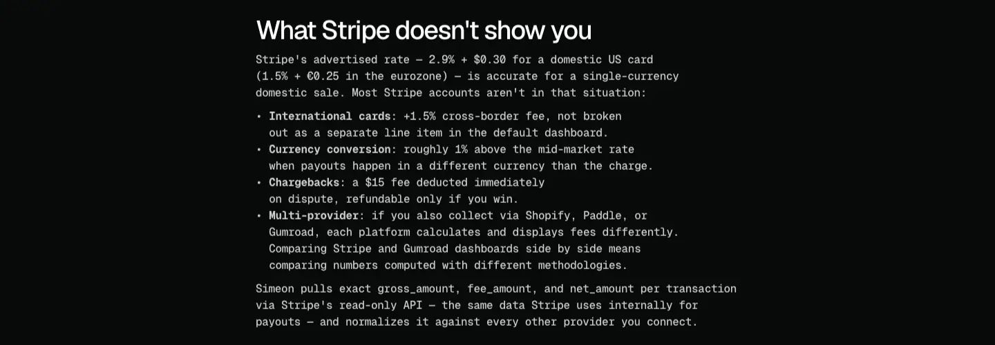
"What Stripe doesn't show you": bold-mono lead-ins (International cards, Currency conversion, Chargebacks, Multi-provider) |
16/24, bold 700 for the lead-in |
| H2 + numbers |
"Worked example": "A $100 domestic sale: $2.90 + $0.30 = $3.20 in fees → you keep $96.80." |
same |
| H2 + steps |
"How it works" (numbered) |
same |
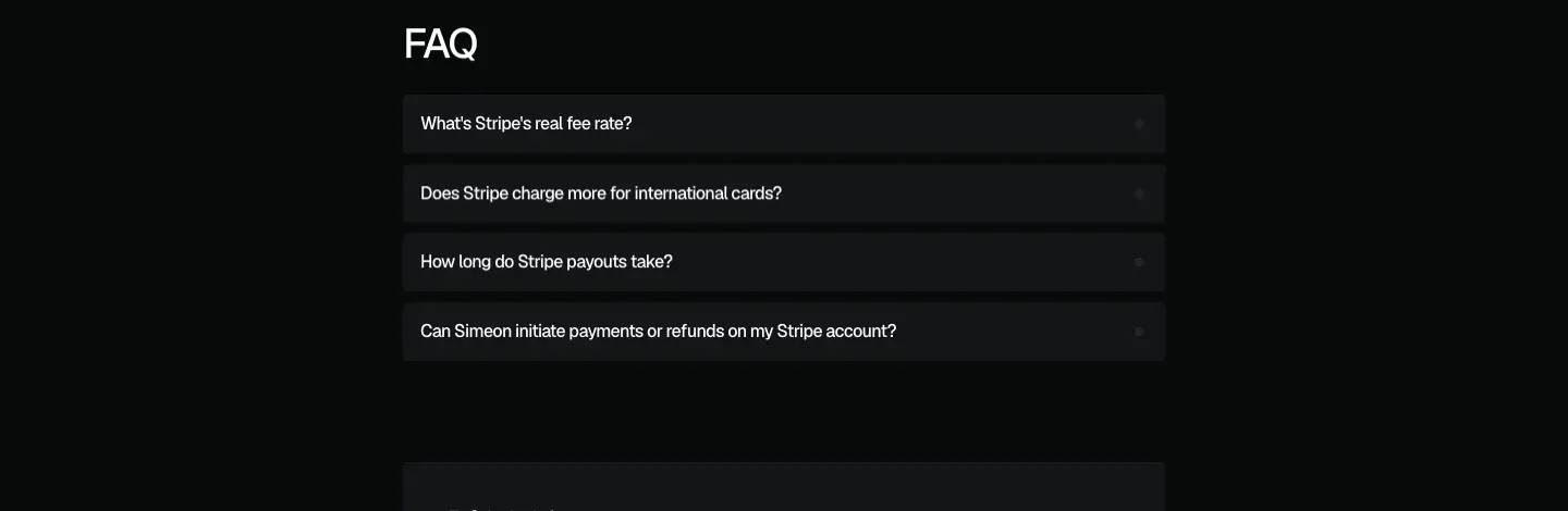
| H2 FAQ |
4 questions |
#131517 rows |
| Closing card |
"Stripe's headline rate is 2.9% + $0.30. Your real rate depends on where your customers are — and everything else you collect." + button |
centred #131517 card |


Variants
- Polar leads with news: "Polar raised its fees 25% in 2026. Does your dashboard show the real impact?" and a dated paragraph (May 27, 2026). crop
- SumUp adds per-country fee tables ("United States", "United Kingdom") and a "SumUp is not a merchant of record" section. crop
Why this template
Each page answers one search ("{platform} net revenue", "{platform} fees") with arithmetic the reader can check. No visuals means a new page costs only writing time. The H1 always restates the pain, the CTA always names the platform.
Issues
/integrations/sumup has the home <title>; the others have unique titles.- Body is 16 px here but 12 px in blog posts: the two long-form templates disagree.
Comparison page template · /vs/*
5 pages: Baremetrics, Google Sheets, Notion, ChartMogul, QuickBooks. Captured: Baremetrics (4042 px), Notion (3046 px).
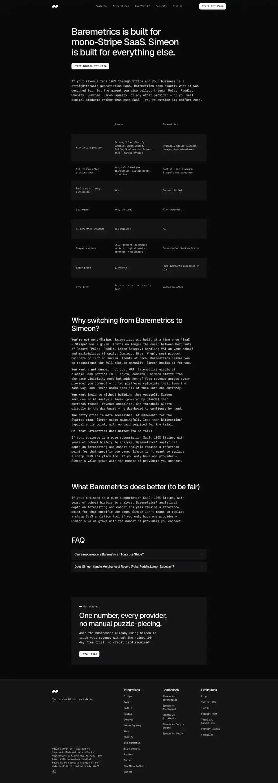
Structure (Baremetrics)
- H1 "Baremetrics is built for mono-Stripe SaaS. Simeon is built for everything else." + "Start Simeon for free". crop
- Intro paragraph (16 px mono).
- Comparison table, 8 rows (Providers supported, Net revenue after provider fees, Real-time currency conversion, CSV export, AI-generated insights, Target audience, Entry price, Free trial); zebra
#131517 rows, 12 px mono, plain sentences. crop
- H2 "Why switching from Baremetrics to Simeon?" with bold lead-ins ("You're not mono-Stripe.", "You want a net number, not just MRR.", …). crop
- H2 "What Baremetrics does better (to be fair)".
- FAQ (2 questions) and closing card "One number, every provider, no manual puzzle-piecing." + "Free trial". crop
The Notion page uses the same parts without a table: "Where a Notion revenue tracker runs into trouble", "What Simeon does instead", "When Notion is still the right tool". hero
Why
"X vs Y" and "X alternative" searches convert well. The "to be fair" section and "when Notion is still the right tool" make the page credible to a sceptical founder and are harder for a competitor to dismiss.
Issues
- All five
/vs/* pages share the <title> "Stripe Net Revenue Dashboard • SIMEON SH" (copied from the Stripe integration page): they compete with each other and with the Stripe page in search.
- Entry price in the table is "$24/month"; the pricing page says "$23/month".
- The closing CTA label changes per page ("Free trial" here, "Start for free" elsewhere).
Blog index · /blog
https://simeon.sh/blog · 2858 px tall · 9 posts
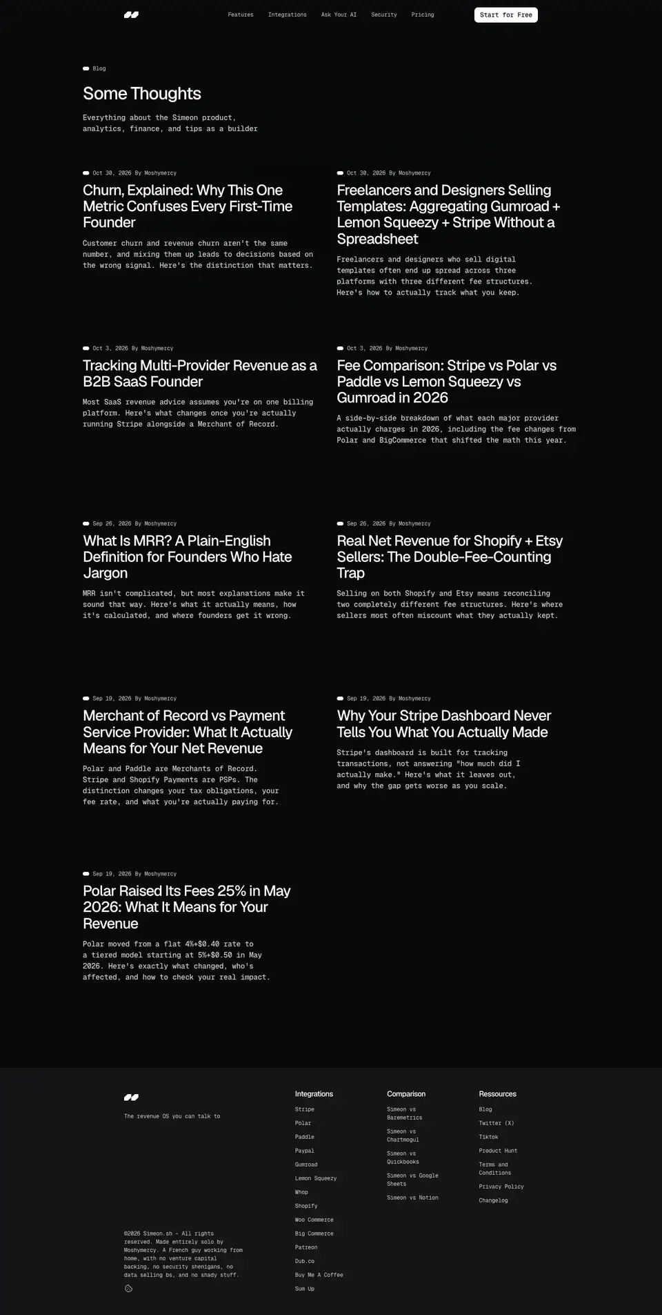
Header
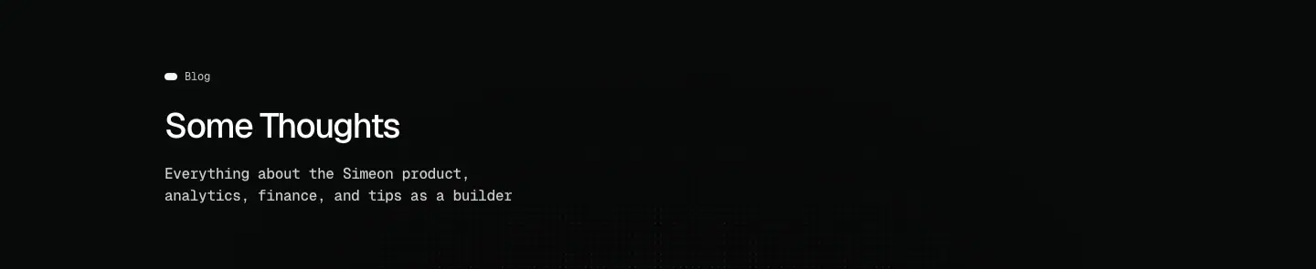 White-dot eyebrow "Blog"; H2 (not H1) "Some Thoughts" 38 px; line "Everything about the Simeon product, analytics, finance, and tips as a builder".
Post grid
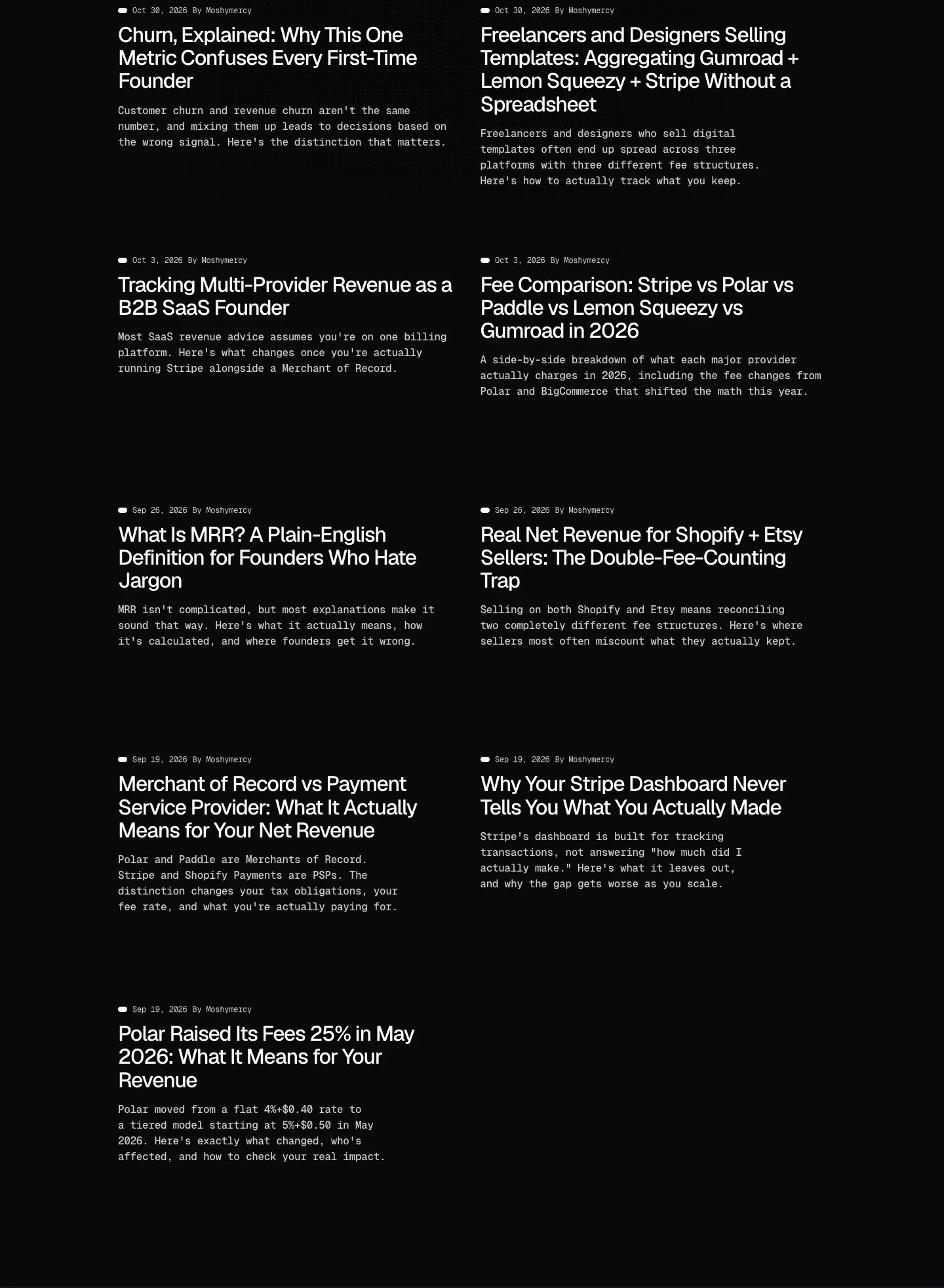 Two columns, 528 px each, 25 px gap, container 1080 px (wider than the 900 px used elsewhere). Each item: white-dot date + "By Moshymercy" (12 px mono), H3 32/35.2 title, 12 px mono excerpt. No images, no tags, no card fill. Rows ≈ 380 px apart.
Why: the blog is a list of essays by one person; titles carry the page. Without images there is nothing to produce per post.
Issues: no H1; the 32 px titles wrap to 3–4 lines in 528 px, so the grid looks heavy; no category filter or search for a blog that is entirely SEO content.
Blog post template · /blog/*
Captured: Why Your Stripe Dashboard Never Tells You What You Actually Made (2292 px) and Polar Raised Its Fees 25% in May 2026 (2288 px).
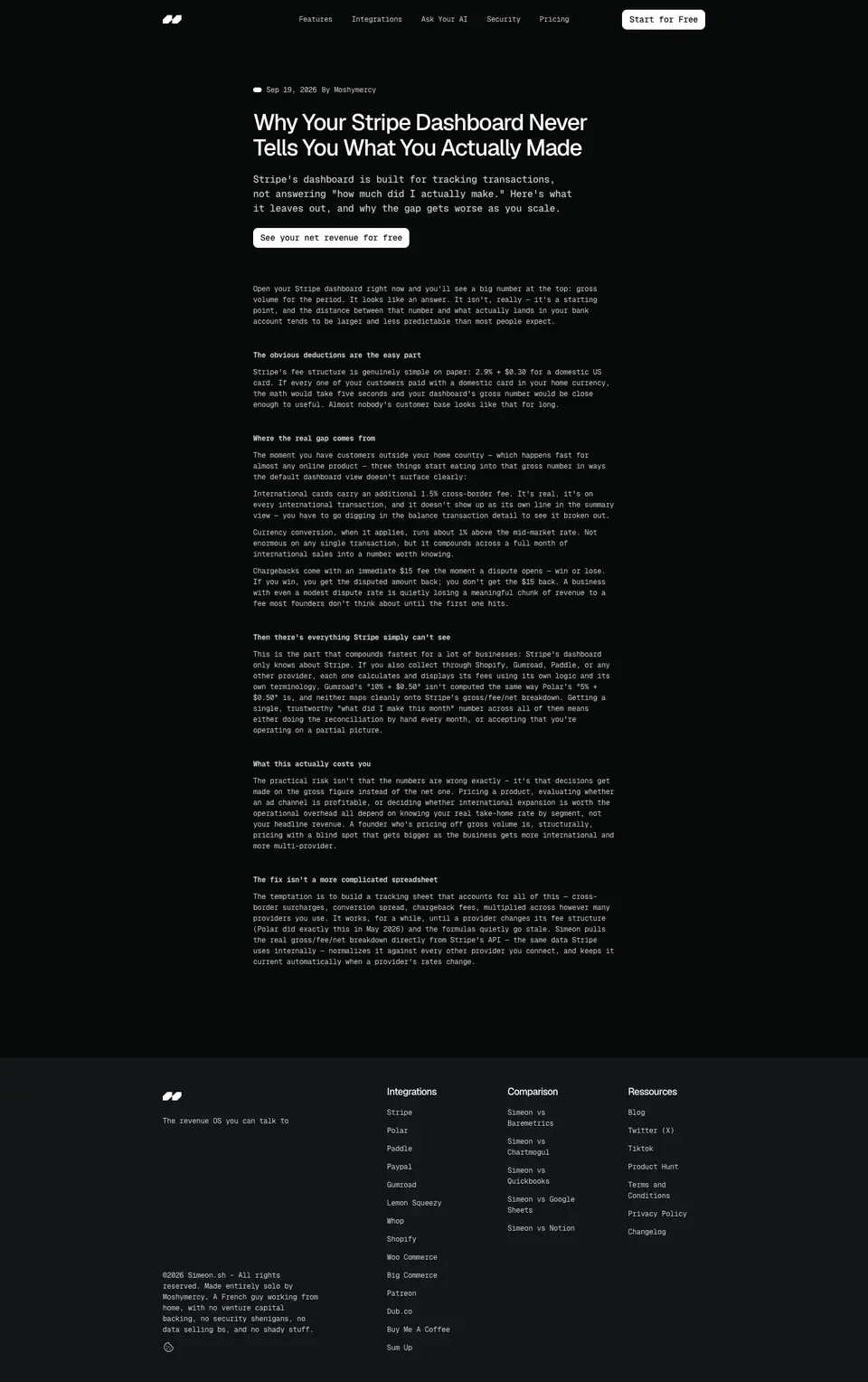
Header

| Element |
Spec |
| Meta |
white dot + "Sep 19, 2026" (<time>) + "By Moshymercy", 12 px mono |
| Title |
H2 38/41.8 Geist 500, 600 px column at x 420 |
| Standfirst |
16/24 mono 500, 3 lines |
| CTA |
white "See your net revenue for free" |
Body
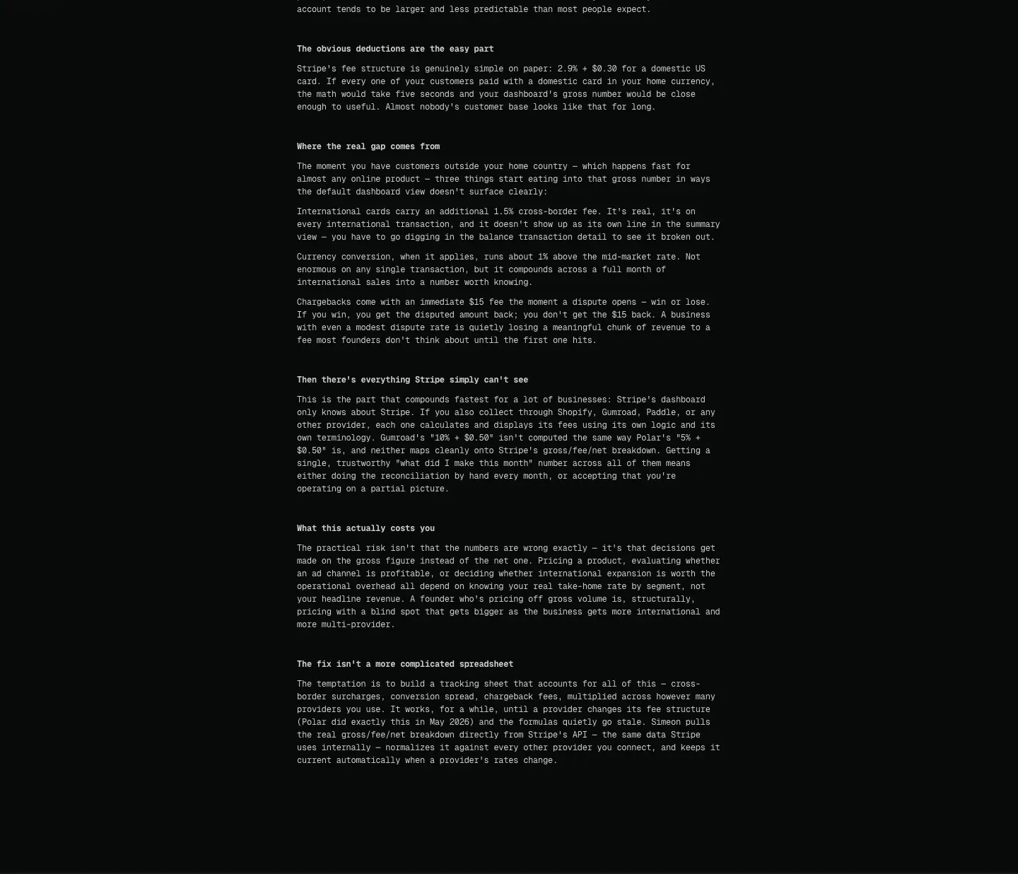
- Column 600 px.
- Paragraphs: 12/18 Geist Mono 400, 80 % white, ≈86 characters per line.
- Sub-heads:
<strong> 12/18 Geist Mono 700, not heading elements ("The obvious deductions are the easy part", "Where the real gap comes from").
- Paragraph gap ≈ 10 px.
- No images, no pull quotes, no table of contents, no related posts.
- Footer follows directly.
Why
The post template matches the rest of the site exactly (mono, dark, no imagery), so posts feel like product documentation rather than marketing.
Issues
- 12 px mono for 1,000-word essays is the smallest body size of any site in this research set. Readable on contrast (12.6:1) but tiring.
- Sub-heads in bold body text give no document outline (no H2/H3 inside the article, and no H1 at all).
- No end-of-post CTA card, unlike integration and comparison pages.
Changelog · /docs/changelog
https://simeon.sh/docs/changelog · 8867 px tall · 10 releases (v1.0.0 → v.1.6.0)

Header
 H2 38 px "Every update, fix, and new feature as they ship."
Release entry
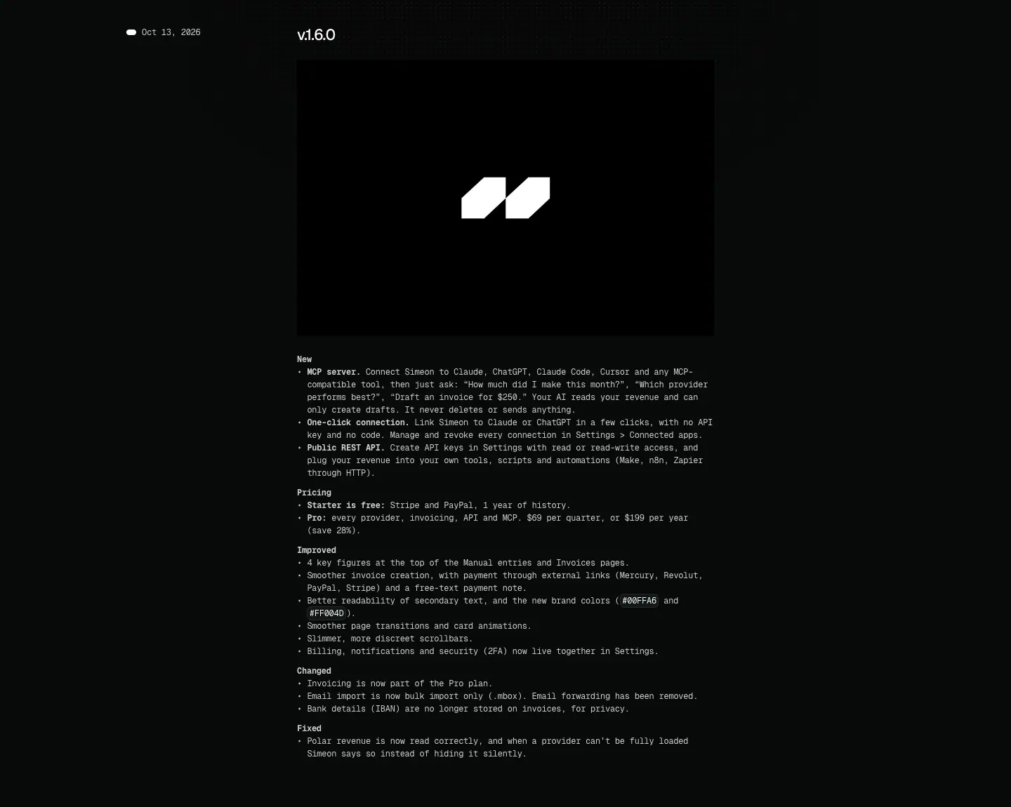
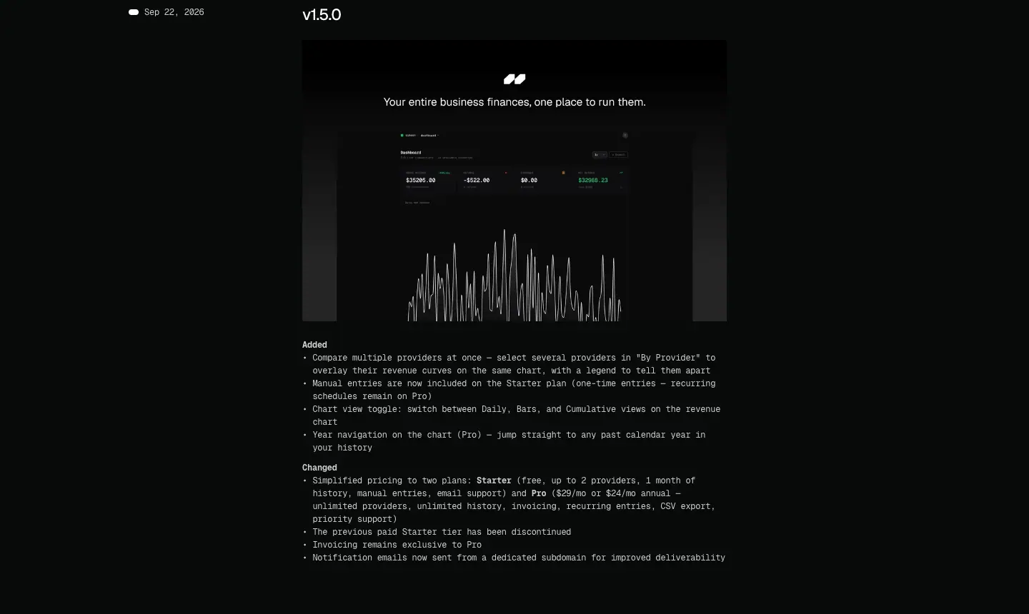
| Part |
Spec |
| Date rail |
white dot + "Oct 13, 2026" <time>, 12 px mono, x 202 |
| Version |
H4 22/24.2 Geist 500 ("v.1.6.0", "v1.5.0": inconsistent prefix) |
| Cover |
594 × ≈395 black tile with the logo mark |
| Groups |
bold 12 px mono labels: New, Pricing, Improved, Changed, Fixed |
| Items |
bullet list, 12/18 mono, bold lead-in per item ("MCP server. Connect Simeon to…") |
| Colour chips |
inline code chips for #00FFA6 and #FF004D |
Release spacing ≈ 600–1100 px depending on length.
Why
Keep-a-Changelog style groups make a solo product look active and accountable; "See what's new" in the hero links here, so the changelog doubles as proof of momentum.
Notes
v1.6.0 documents brand decisions: new brand colours #00FFA6 / #FF004D, "Better readability of secondary text", "Smoother page transitions and card animations", "Slimmer, more discreet scrollbars". It also states pricing ("Pro: $69 per quarter, or $199 per year (save 28%)").
Legal pages · /docs/*
Four pages: Privacy policy, Terms and conditions, Sub-processors, DPA. Captured: privacy policy (7239 px).


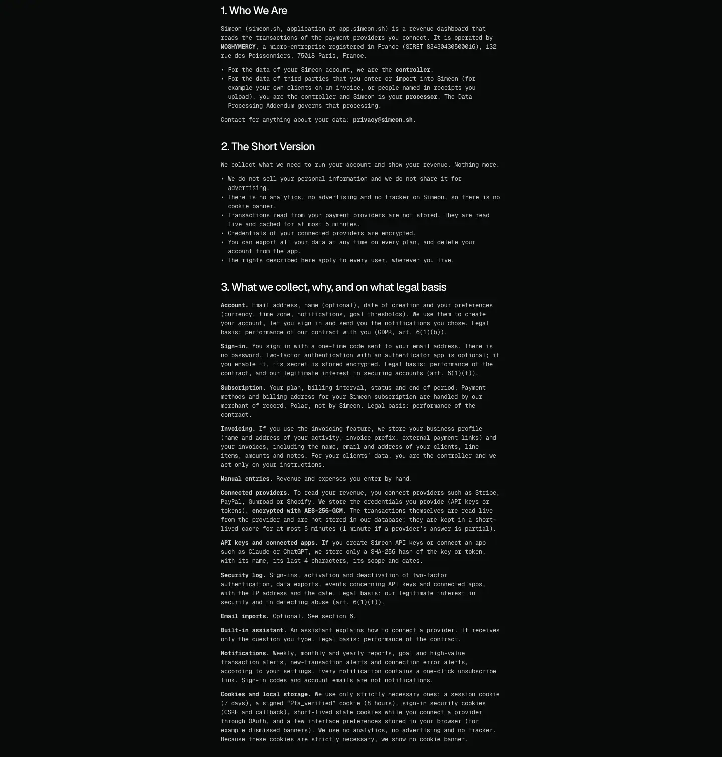
| Element |
Spec |
| Title |
H1 48 px "Privacy policy" |
| Sections |
15 numbered H4 22 px headings ("1. Who We Are", "2. The Short Version" …) |
| Body |
12/18 mono, bold 700 lead-ins (e.g. "MOSHYMERCY") |
| Column |
≈600 px |
Why: same template as the changelog. "2. The Short Version" up front is a trust move consistent with the rest of the copy. A DPA and sub-processor list are unusual for a solo product and support the "Secure by design" claim.